About
Type of client
- Beauty & Healthcare
Price range & timing
TEAMS INVOLVED
Ana Ramos: Creative Director
Carlos Serna and Alvaro Liniers: Art Direction
Logo
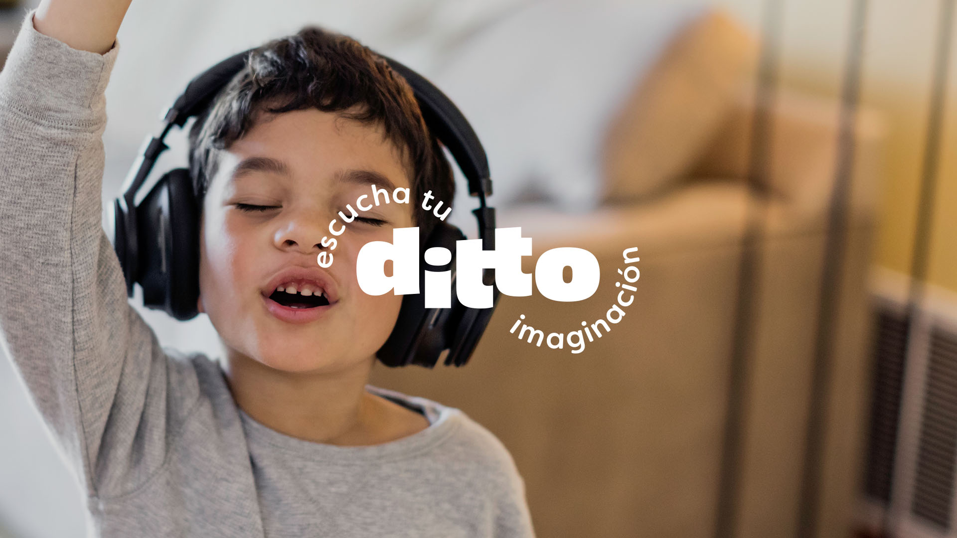
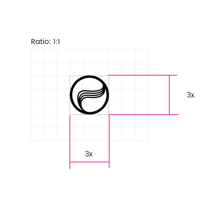
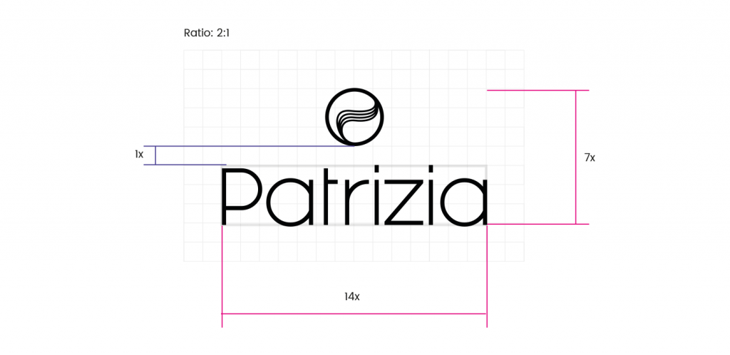
Our logo is approachable, clear and makes easy the brand identification. The contrast between black and white, straight and curved lines, contribute to immediate brand recognition. It communicates professionalism and elegance, happiness, fantasy, youth, activity, and energy
Typography and Colors
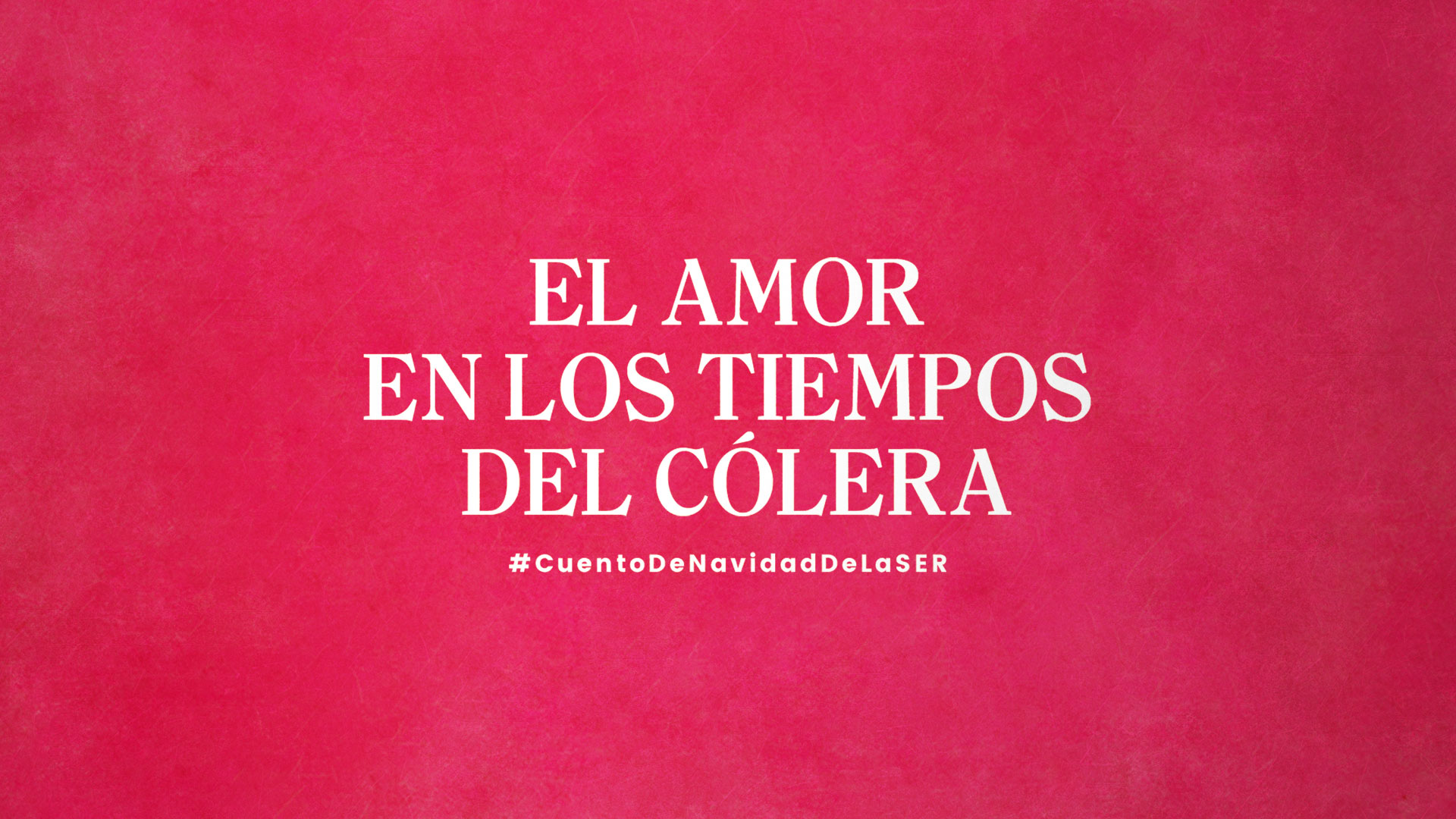
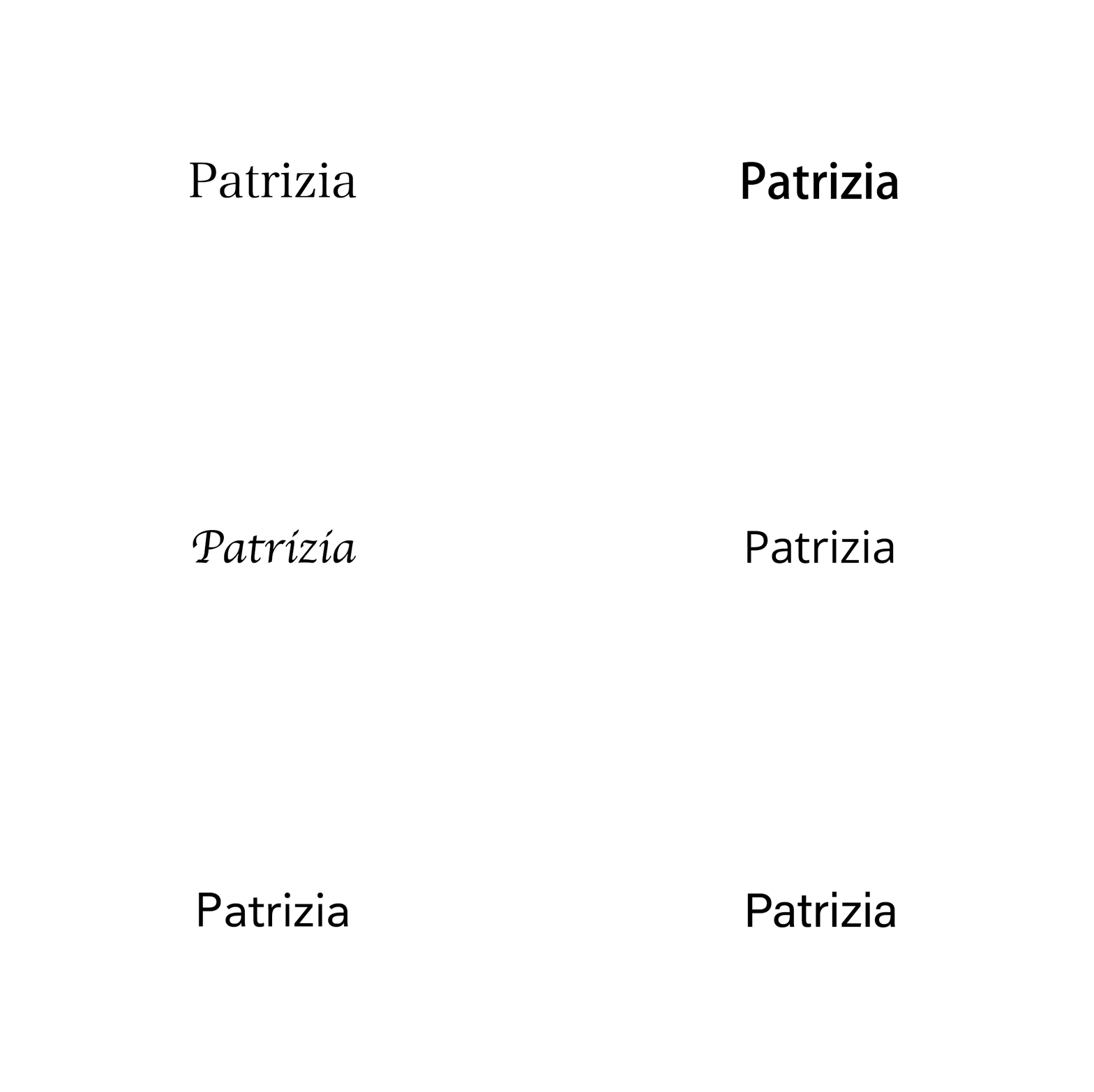
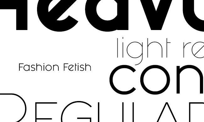
A young and energetic font that represents vitality, elegance, and professionalism, based on the contrast of straight lines and curves. Combined with a sans serif font that enables readers to focus and immerse themselves in the content of the text. The result, a brilliant typographic combination.
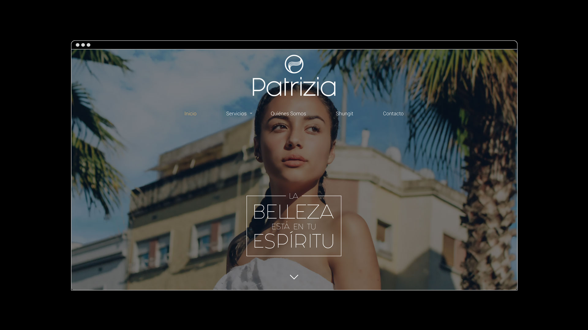
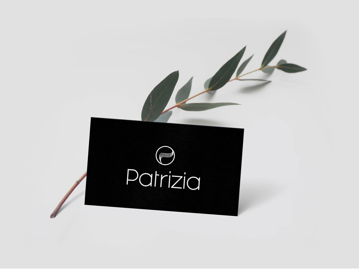
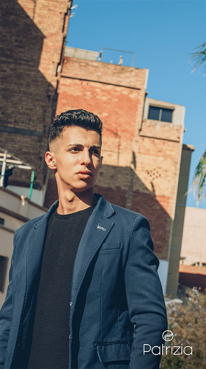
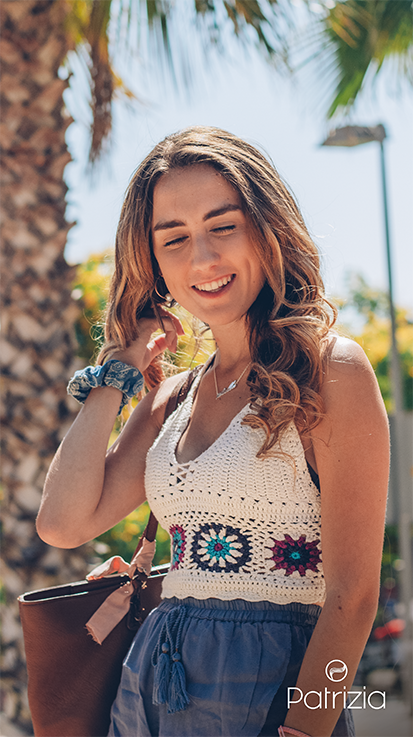
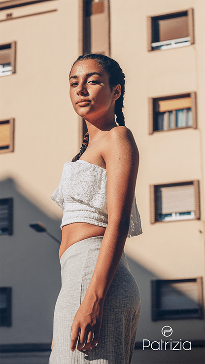
A fixed colour palette, dominated by white and black. The images provide the touch of colour. A business of big contrasts.

Photography
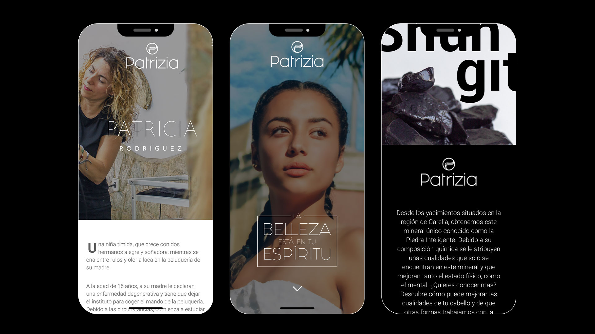
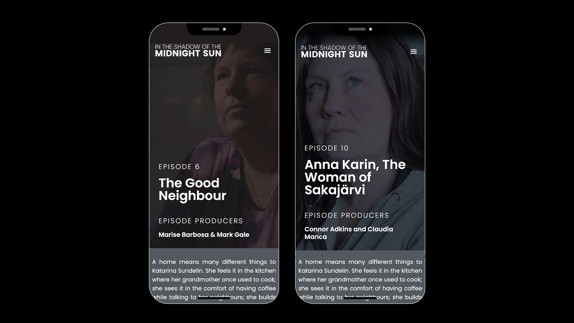
Web design
