About
Samuel Torres is a personal trainer specialised in movement and bodyweight, co-founder of Madrid’s training center ‘T-Center’.
With Silverback Training, he aims to create a training and fitness platform accessible to individuals of any initial level: people who are new to the world of exercise to high-performance athletes. The overall goal of the project is to help people improve their performance, aesthetics, health, and optimal movement levels to achieve a better quality of life.
Type of client
- Fitness & Training
Team involved
FLAT26: Creative Direction & Art direction
7.000€ – 10.000€
6 month
Look & Feel: Fluidity and Flexibility
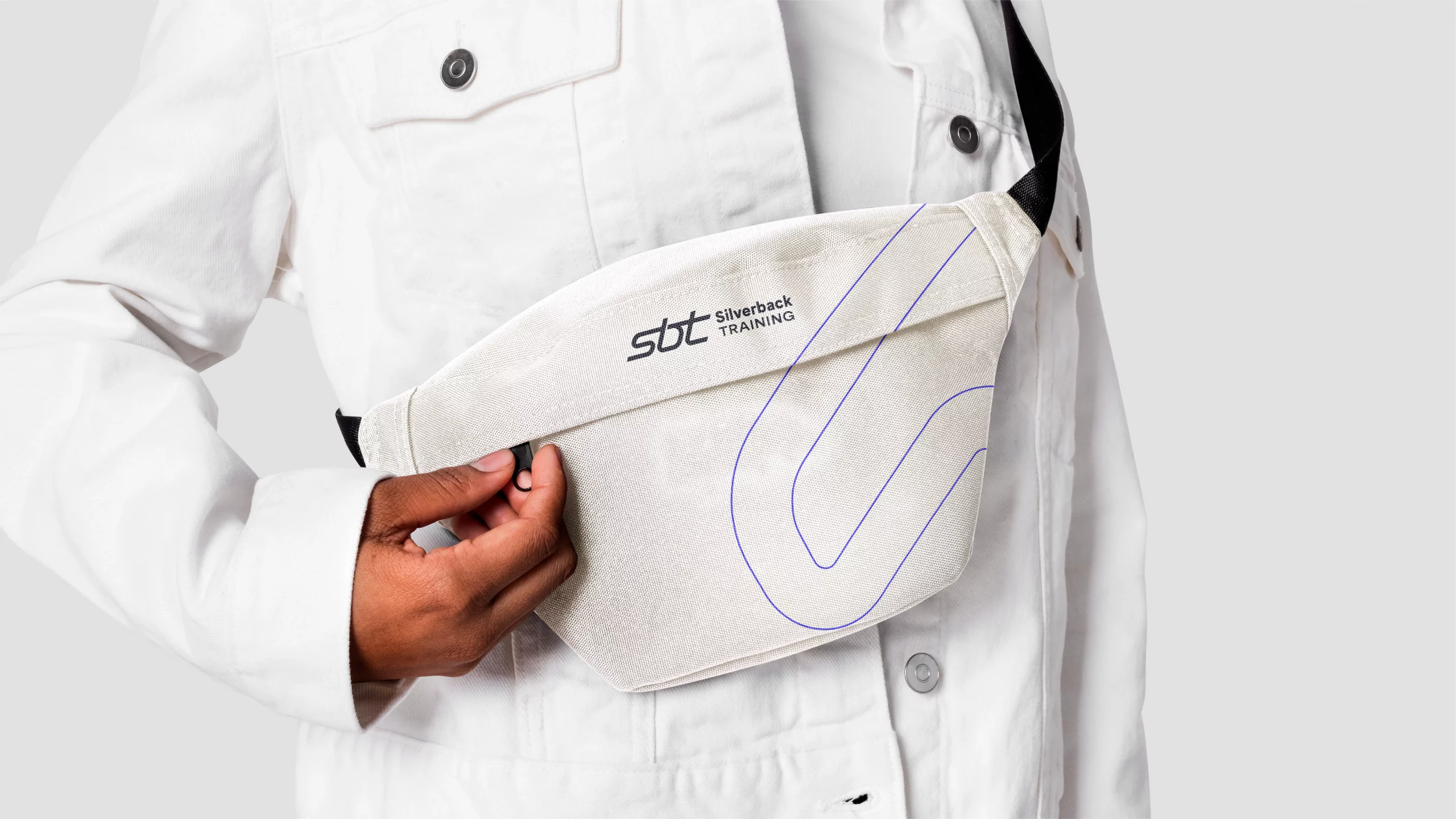
We designed a fluid, dynamic and impactful monogram, where the letters that compose it are united in a single stroke. The corners and angles are rounded to visually represent the fluidity and flexibility of the body’s movements.
The typographic element is geometric and clear.
The logo has been designed and tested to perform in both digital and printing environments.
We selected a simple color palette composed by highly contrasting tones; we achieved a clean and modern look that represents the essence of the brand and is optimized to work on a mobile support.




From UX to UI
Our journey begins with a meticulous focus on user experience (UX) principles, ensuring that every aspect of the project is designed with the utmost attention to detail. This process involves a comprehensive refinement of the entire graphic interface system, where each element is carefully crafted to harmonize with our brand’s identity and resonate with our target audience.
Our commitment to excellence in UX design extends beyond surface-level aesthetics. First, understanding the users’ needs, preferences, and pain points. Through thorough research, user surveys, and usability testing, we gather valuable insights that inform our design decisions.
We create an intuitive and user-centric interface that enhances the overall user experience by applying these insights. From the placement of buttons to the choice of colours and typography, every element is carefully considered to ensure ease of navigation and engagement.

Wirefames & prototyping
We follow a systematic approach to wireframing our app, progressing from low-fidelity sketches that establish the basic layout and user flow to mid-fidelity wireframes with added UI elements and interactivity. Our high-fidelity wireframes represent the polished design with precise styling and are used to create interactive prototypes for testing. After incorporating feedback and finalizing the wireframes, we move on to the development phase, ensuring a smooth handoff of design assets and thorough quality assurance before launching the app to the public, continually considering user feedback for future enhancements.


