About
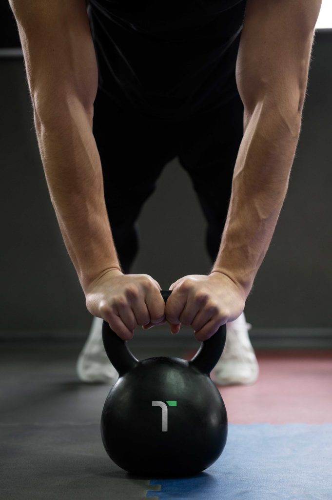
T-Center is the center for personalized training, aimed at anyone who values their health, whether it’s for treating illnesses, starting to improve their life, or continuing to progress in various sports disciplines. It helps you achieve your goals through a guided learning process accompanied by qualified personnel.
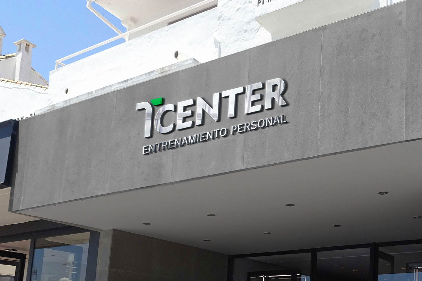
We were approached to revamp the center’s image, encompassing the development of a new logo along with its versatile brand applications, and a comprehensive website redesign.
Type of client
- Fitness & Training
Team involved
FLAT26: Creative Direction & Art direction
10.000€ – 12.000€
6 month


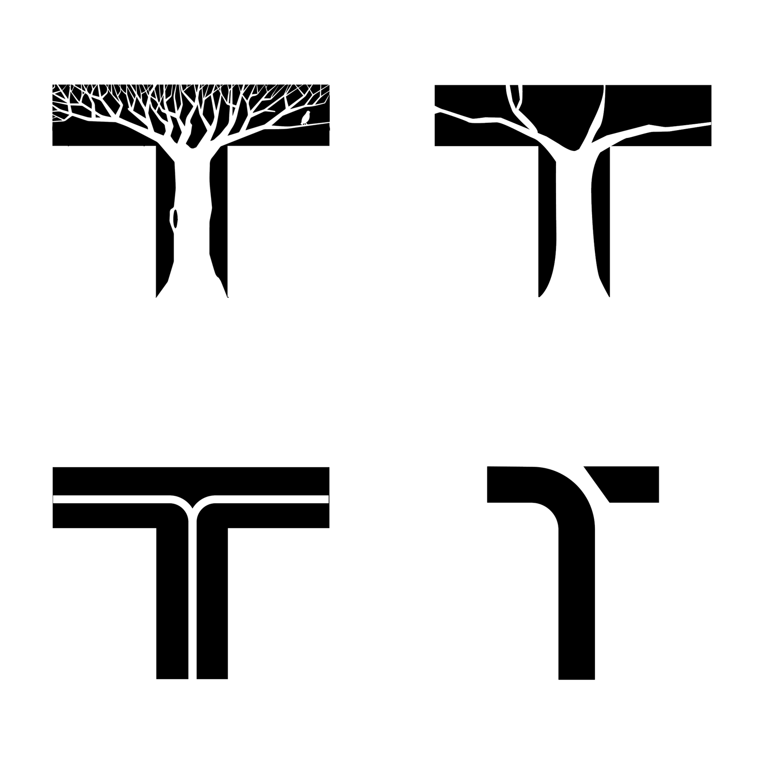
Logo concept
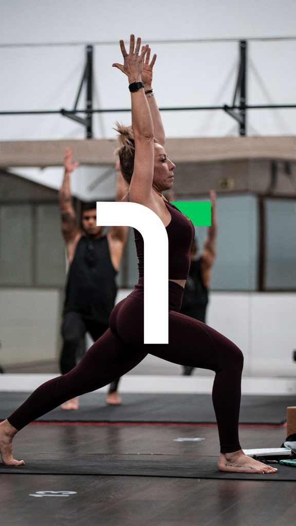
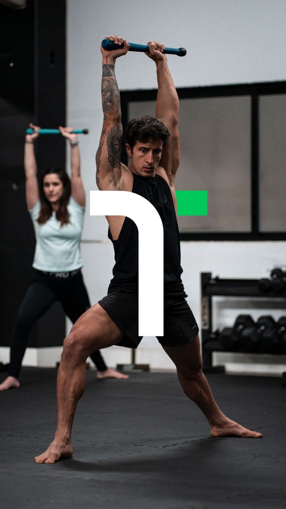
This proposal reduces the tree element to a curved line, representing the branches. The ‘T’ has been stylized, and with the cut made by the ‘branch’ of the tree, a simple and easy-to-remember shape is achieved. It combines straight and curved lines, giving it dynamism and a sense of movement. The logo also represents balance, a cut shape that may seem unstable but is in perfect equilibrium and harmon
