About
Ditto is an online audio platform designed to stimulate and awaken the imagination and creativity of children. Through music, literature in audio format, tales and natural sounds – all backed by neuroeducators and sorted by age – Ditto gives children some space to imagine things in a world dominated by screen time.
We were challenged to create a brand identity that explored concepts like innovation, learning, entertainment and safety and that would connect with the product’s main audiences (children, teachers and parents).
We came up with a fun, bright and playful design where shapes and a lively color palette become key elements of an integrated system. Our proposal included dynamic characters that make their way into the children’s lives through photographic compositions, adding to that feeling of movement and fun.
Type of client
- Banking
Team involved
FLAT26: Creative Direction & Art direction
6.000€ – 8.000€
6 month
One of the key challenges of the project was to create a brand that catered for both kids and adults, both critical users of the product.
Our proposal blends movement and a dynamic look & feel to keep children engaged, with a round typography and a pleasant color palette that conveys safety and innovation for parents and teachers selecting the audio contents and navigating the platform.
Naming & Logo
The brand needed a bright, catchy name that could easily be pronounced by children to encompass this idea of fun, learning and education. We got the product creators and our team involved in a workshop where we defined the brand’s personality and what it stands for to come up with a powerful naming and tagline, and the name Ditto was born.
It is a short brand name, fresh and easy to memorize and to pronounce for both kids and adults. It also sounds the same in different languages, which allows for the brand’s future expansion into non spanish speaking markets.
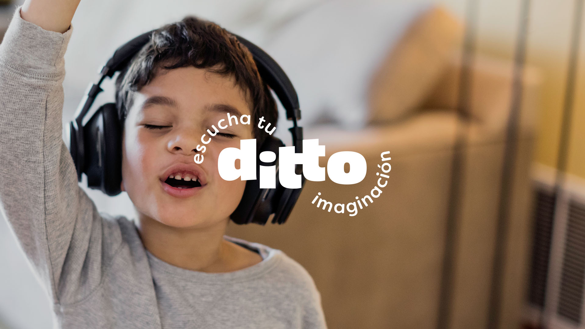
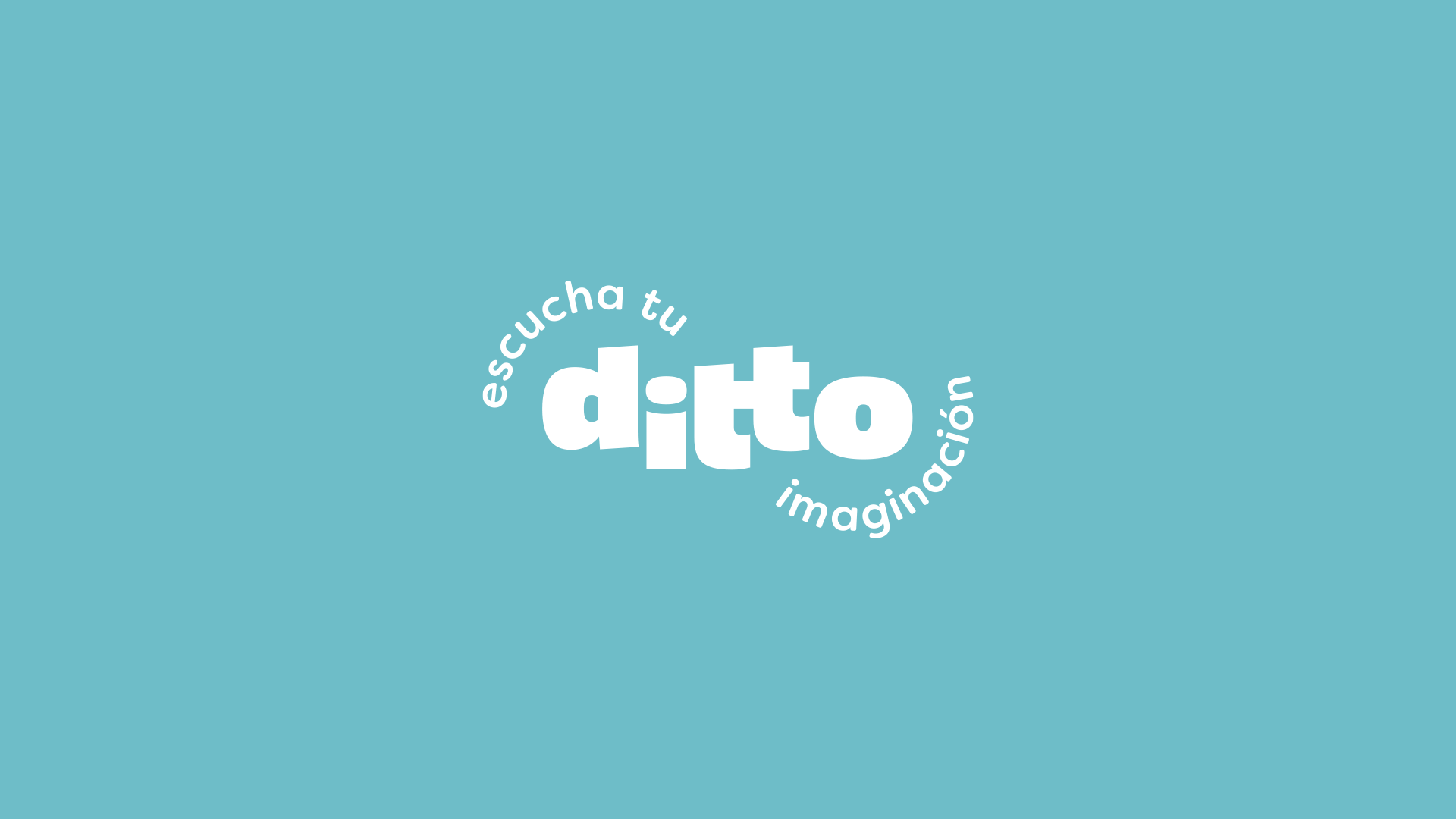
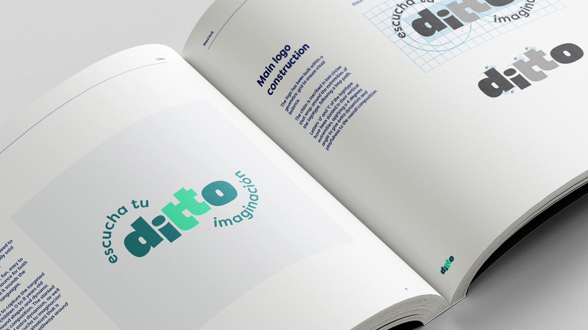
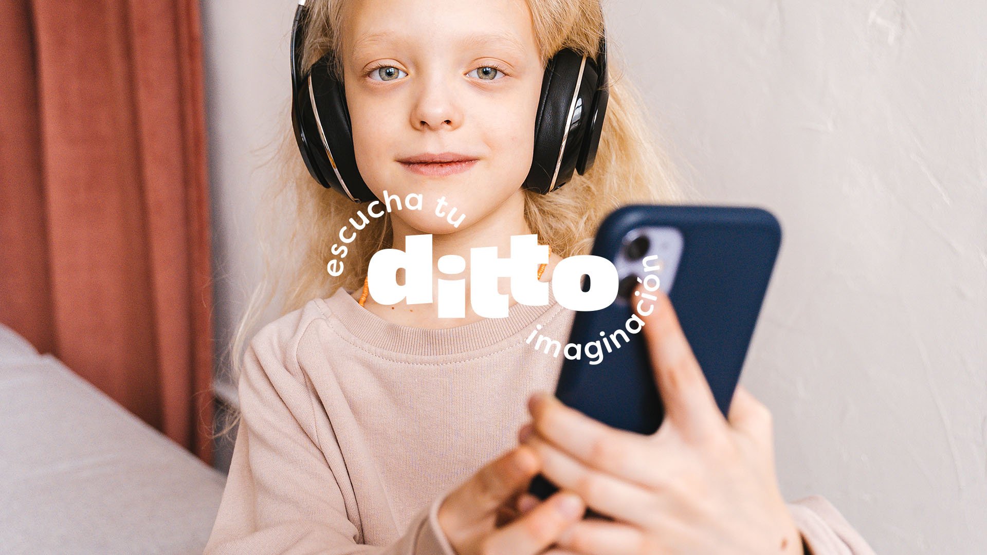
The logo aims to capture the targeted audience – children 0 to 8 years old – with its round shapes and dynamic typographic composition. The slanted ‘d’ and ‘t’ add extra playfulness as well as the tagline ‘escucha tu imaginación’ (listen to your imagination) that is wrapped in curved pathways around the logo.
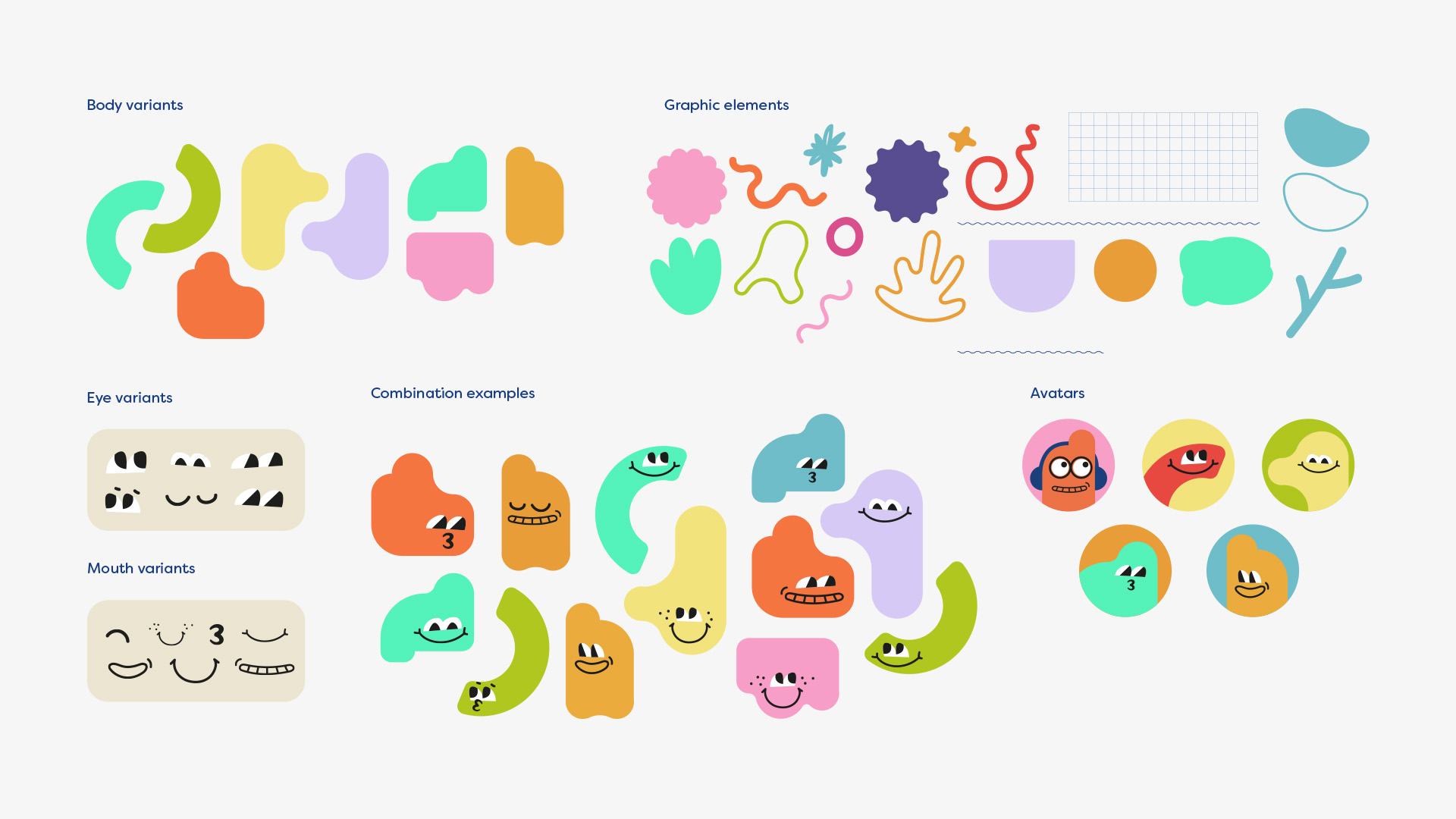
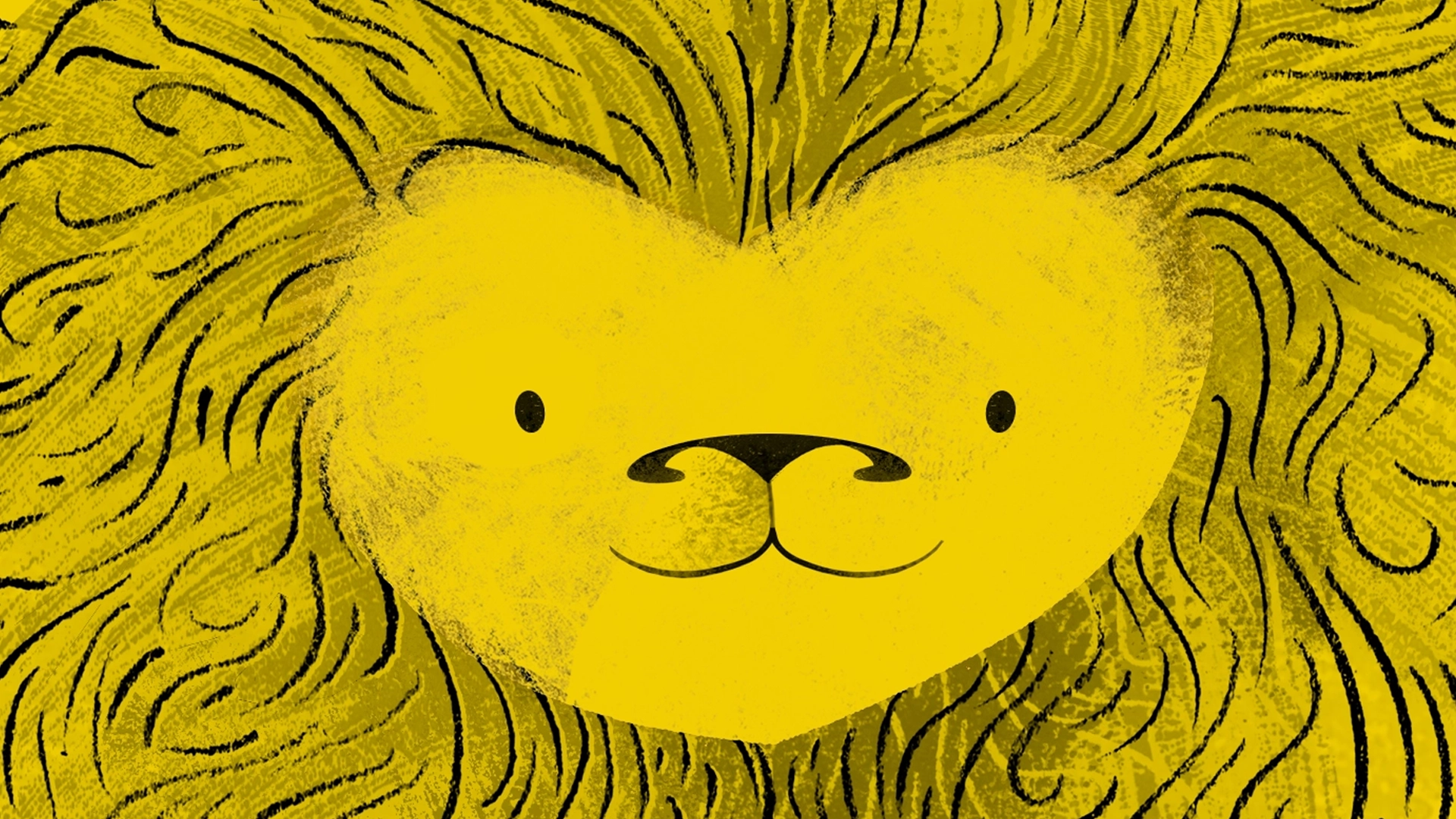
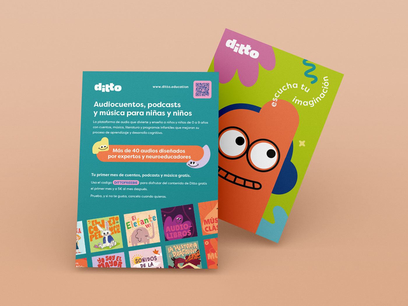
An evolving set of graphic elements and characters with curved and playful silhouettes complete the brand’s visual identity.
Characters are modular, composed by body, mouth and eyes variants that can be combined freely, adding to the sense of playfulness and authenticity and catering for the brand’s different needs and projects.
Applications
We developed the brand’s visual identity into a series of applications for different audiences and channels.
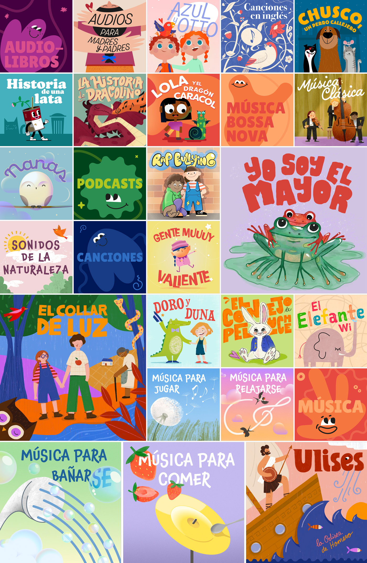
From powerful presentation materials and decks (both internal and external aimed at potential investors and other stakeholders) to key marketing assets, we also created lively covers for each audio within the platform, offline materials and a set of Social Media templates.
UX/UI
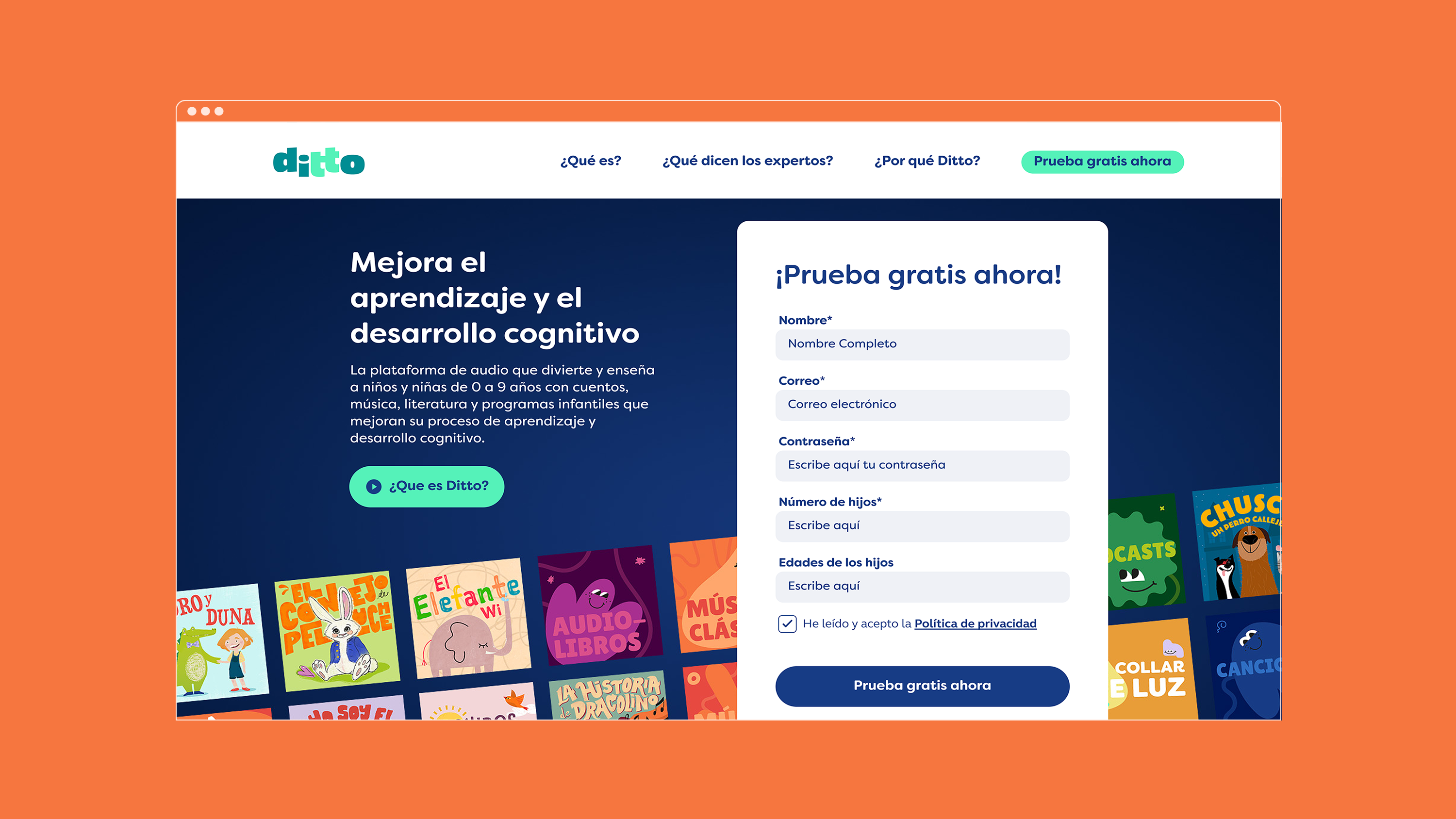
FLAT26 worked alongside the technical developers at Ditto to create a clear and user friendly landing page that would enable subscriptions to the product.
We developed a clear and effective web structure and organized information through wireframes before applying the brand’s visual identity to create a smooth user experience. We also integrated all these design elements into a design system that allows the brand to grow while staying consistent with its core principles.

Animation
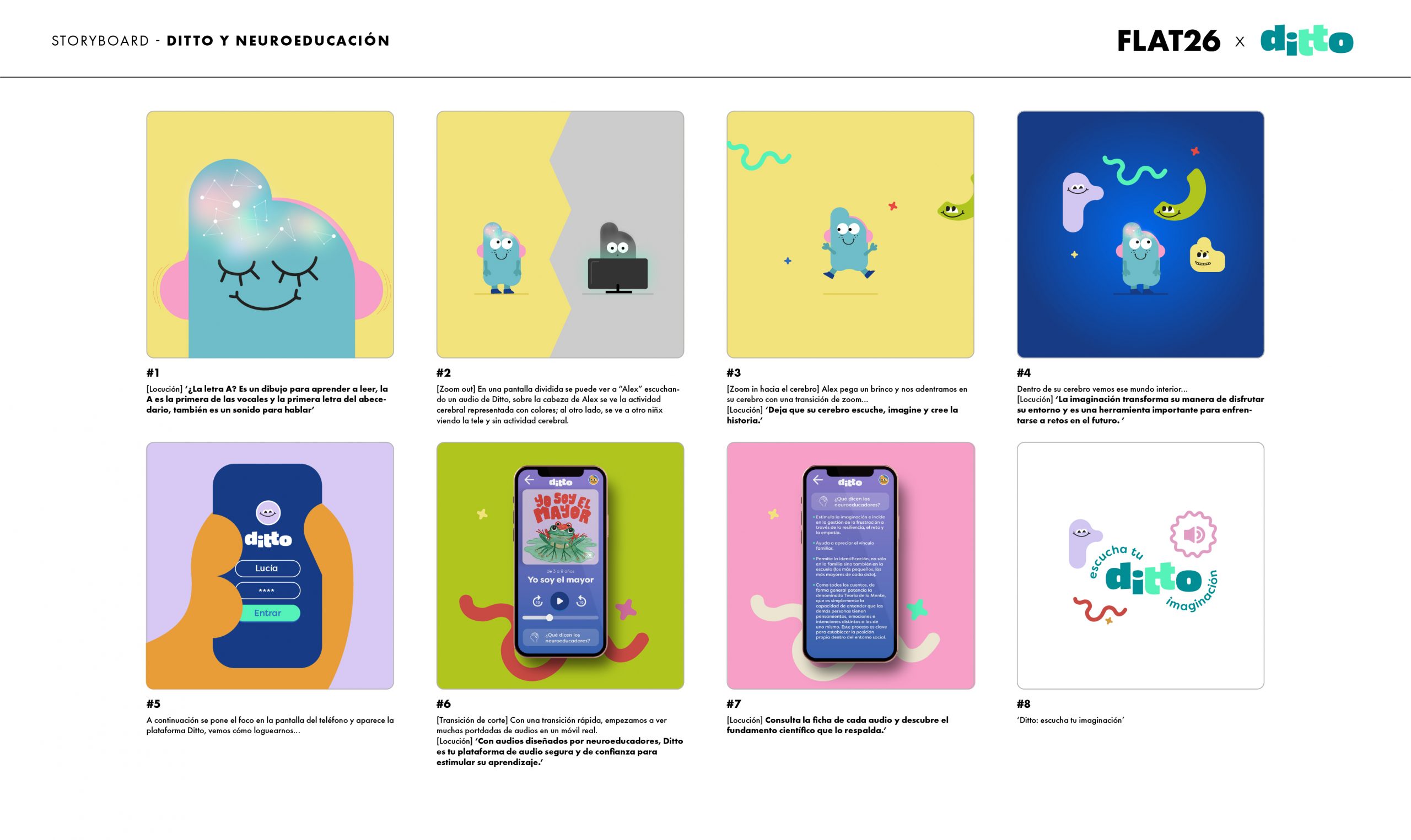
We also enriched the brand’s presentation with unique and creative motion designs. FLAT26 was responsible for the artistic direction of a series of presentation videos to build on the brand’s key concepts and foundational values.
For each video, we first came up with a script that would explore one of the brand’s fundamental ideas. This script was then applied to a storyboard and presented to the client. The final step was the character animation, where the brand’s shapes and characters come alive to elevate the brand’s message through storytelling.
