About
Emporio Italia is an e-commerce that provides its customers with the opportunity to engage with the Italian gastronomic and cultural heritage, in a fun and cool way, by offering a wide range of high- quality products across the Iberian Peninsula.
The company seeked our services after one year in business, in order to improve its overall presence and consequently its sales. After an in-depth analysis we identified the business’ pain point and developed a 360 degrees strategy, involving three different teams.
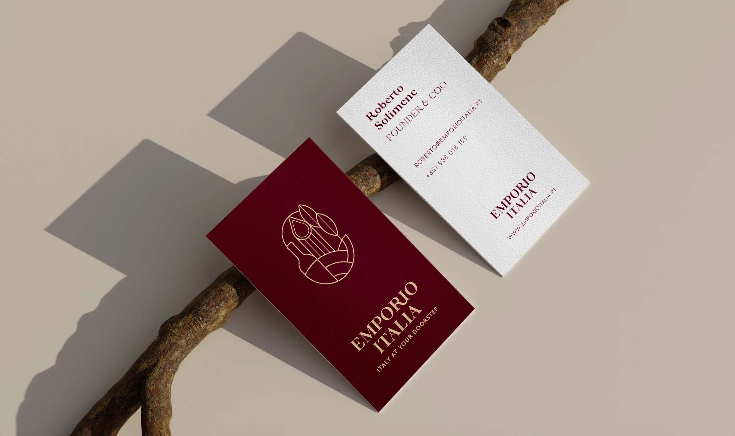
From a design point of view, we operated a full rebranding: we redesigned the logo, as well as the visual assets and the tone of voice, conveying those intangible values that make Italian culture unique.
Ultimately, we redesigned the whole e-commerce platform, integrating the new look and feel and creating a much smoother customer journey.
Type of client
- HOSPITALITY AND FOOD
Team involved
FLAT26: Creative Direction & Art direction
7.000€ – 10.000€
6 month
The meeting point for the authentic Italian culture and gastronomy
Emporio Italia’s identity seeks to reflect the Italian elegance and uniqueness, in a conjunction of hidden and not-so-hidden symbols joined in the frame of an Italian landscape: a postcard of love, beauty and nostalgia.
“Italy is vibrant, passionate, loud but at the same time delicate, caring and fragile. Italy is a country of culinary excellence and simple sophistication. It’s the country of excellence in craftsmanship. This is true also in the italian food industry, where big companies as well as small artisans producing unique delicacies coexist.”
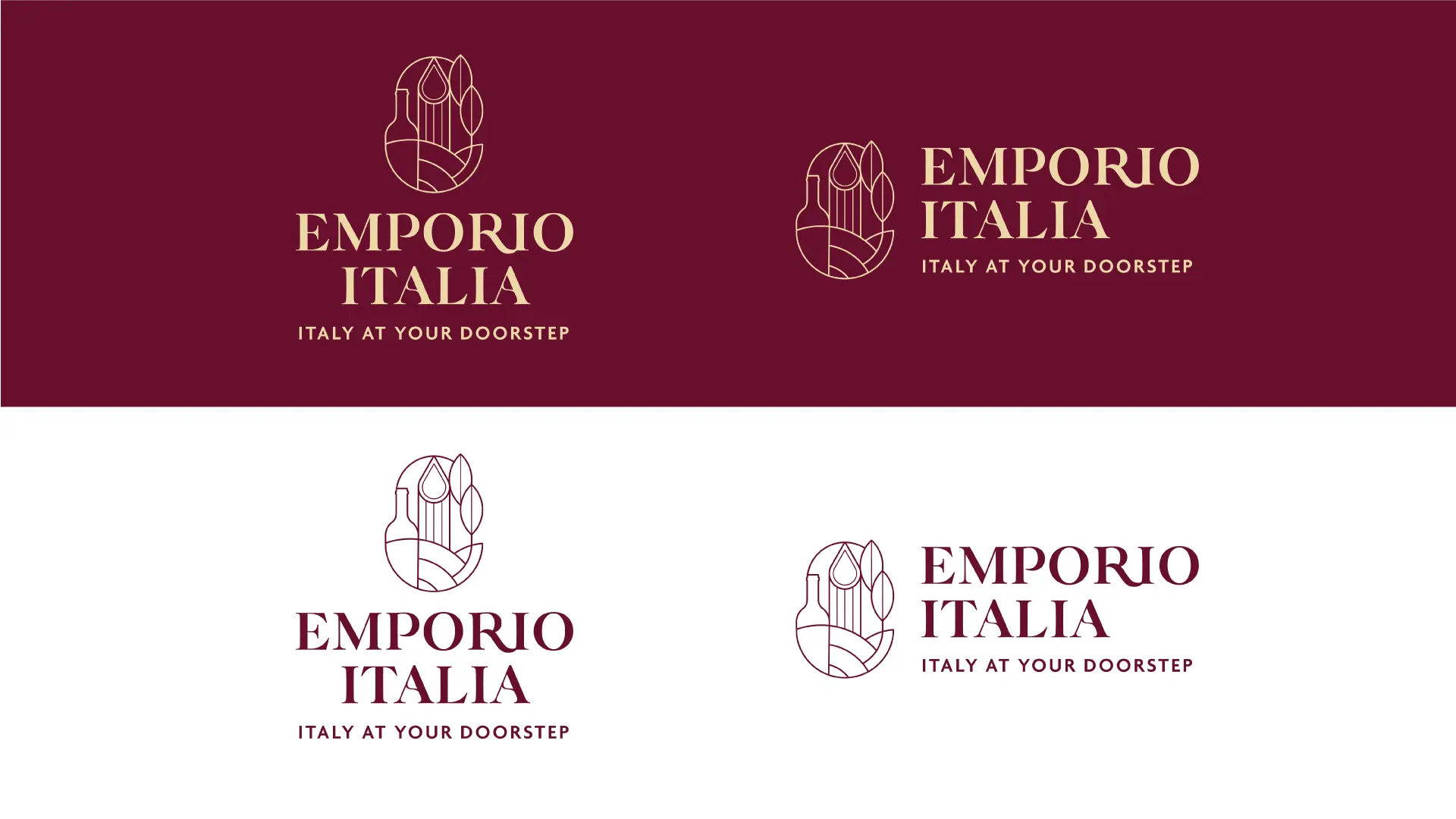
The symbol is built within two oval concentric frames, that encapsulate a bottle, a piece of pasta, the iconic Italian hills and two olive leaves, representing the connection with the high quality raw materials of the territory.
The logotype is elegant and modern; the particular serifs of the letters make it sumptuous, classy and unique, reflecting at best Emporio Italia’s brand personality.
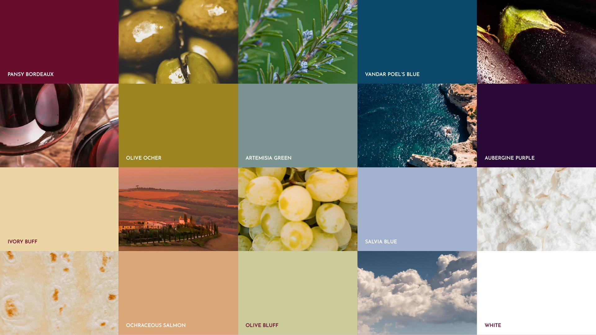
Colour Palette
We defined a colour palette composed by strong and earthy tones inspired by the food world. The colours are classy but accessible, elegant but modern, representing Emporio Italia’s brand values at their best.
This set of colours transport the viewer’s mind to the Italian villages, in a world of fresh produce, authenticity and artisanality, creating beautiful contrasts and harmonies, resembling the shades of the Italian territory – where quality and handmade join forces.
Applications
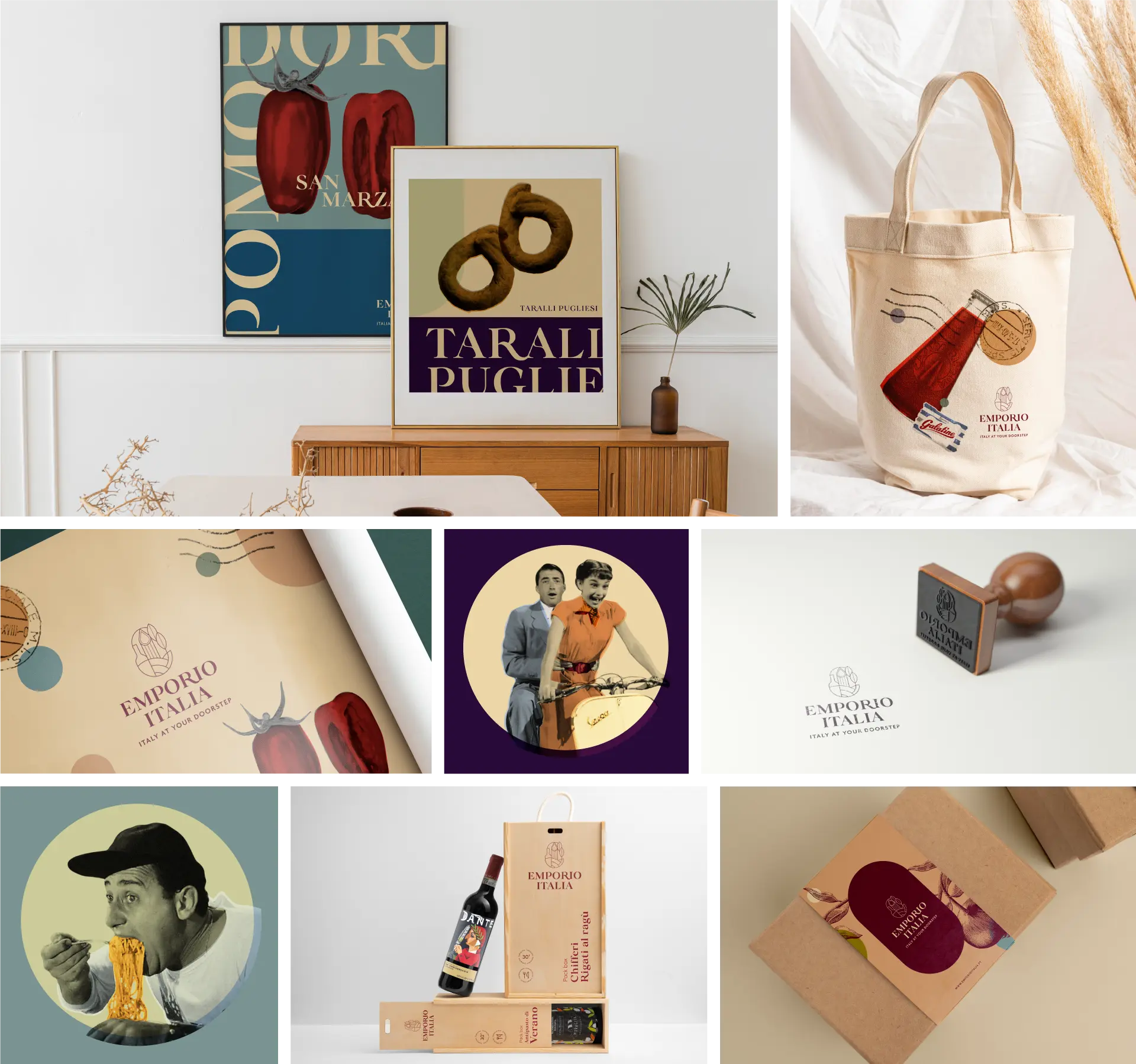
We designed set of complementary graphic elements, to provide Emporio Italia a flexible visual expression in its different channels and contexts.
From pop-art illustrations, to geometric shapes and typography, these elements help convey the idea of ‘Italianity’ with freshness, without resorting to the usual stereotypes, adding dynamism and modernity to the composition.
UX/UI
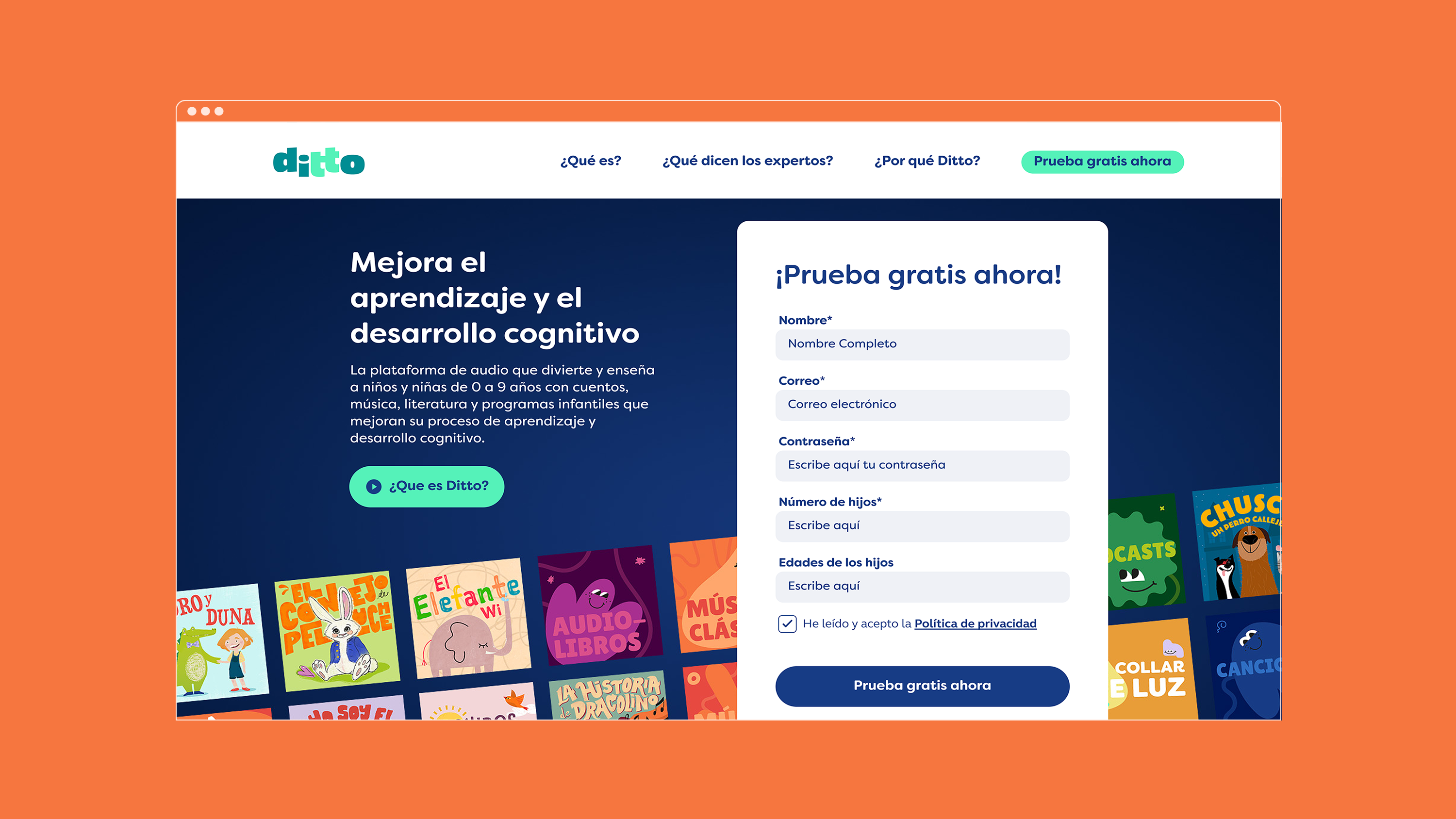
FLAT26 worked alongside the technical developers at Ditto to create a clear and user friendly landing page that would enable subscriptions to the product.
We developed a clear and effective web structure and organized information through wireframes before applying the brand’s visual identity to create a smooth user experience. We also integrated all these design elements into a design system that allows the brand to grow while staying consistent with its core principles.

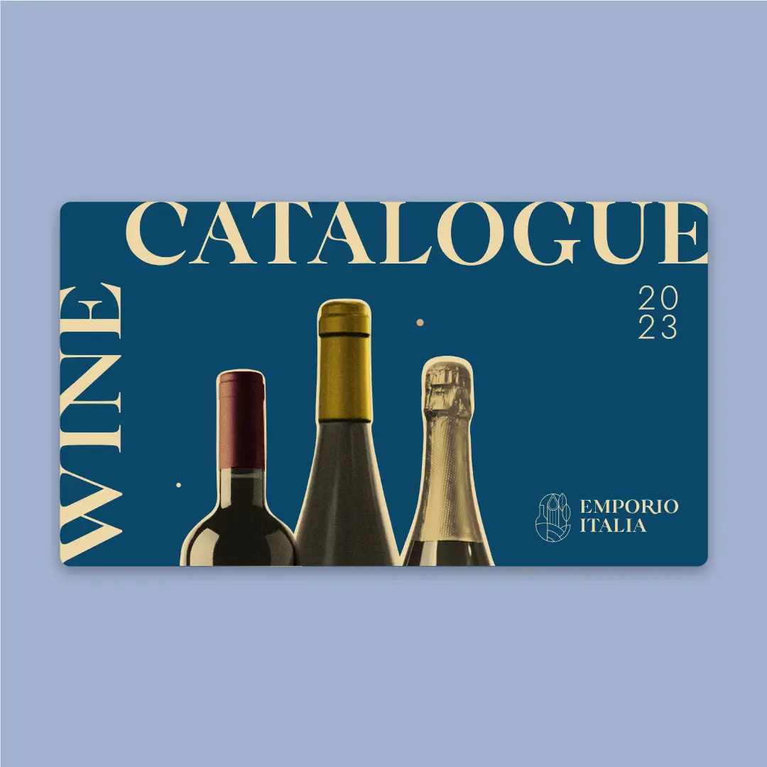
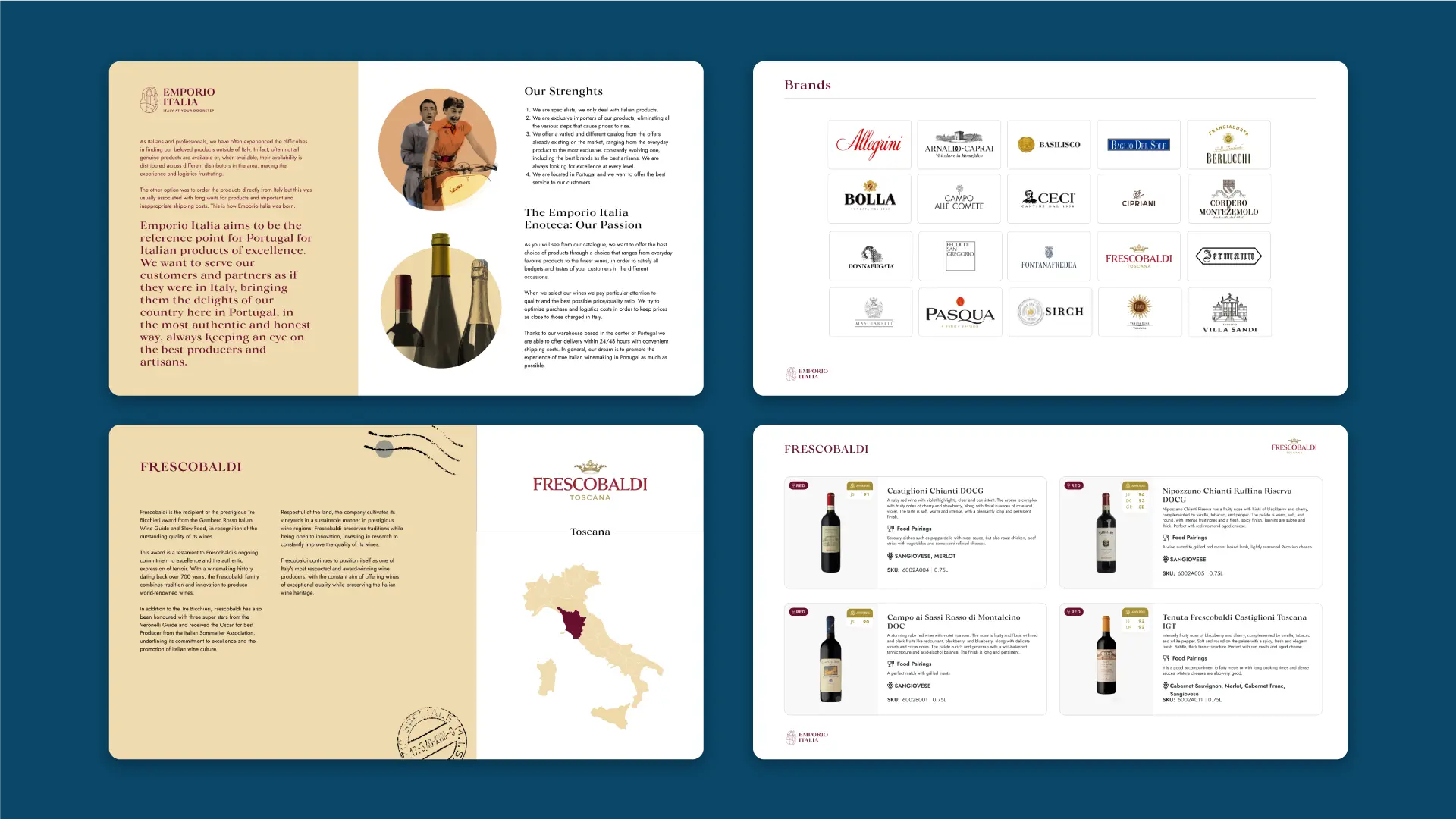
Wine Catalogue
We also designed a Wine Catalogue, with Figma. By using this tool, we created a scalable design that allowed the client the independence to update the Catalogue without worrying about misplacing any of the composition assets.
The Wine Catalogue was a distinct piece from the remaining graphic assets we created, due to it being destined to a B2B communication, requiring a more formal and analytic approach.
