Turning complexity into a cohesive system
About
Vistra, a global provider of corporate and fund services, initially sought Flat26 for digital ecosystem improvements. This evolved into a strategic partnership during Vistra’s transformative acquisition of Tricor. Flat26 provided UX design, design systems, interaction, and documentation to unify Vistra’s identity and products.
Type of client
- Corporate
Team involved
FLAT26: Design Systems, UX/UI Design, Interaction & Motion Design, Documentation
48K+
+12 months
Audit and Design principles
We started with a brand and product audit to better understand the new reality: teams across different countries, products with varying levels of maturity, and a visual identity that needed to be grounded in specific digital design decisions.
We defined together guiding principles for the new system: Human, direct, purposeful, and confident. These principles allowed us to make design and interaction decisions aligned with the brand’s new direction.
Foundations and design decisions
We created a solid architecture based on tokens, organized in two levels: core and semantic, with the structure prepared to support future component tokens. We worked on:
- Typography (tokens for desktop and mobile)
- Grid system and breakpoints
- Spacing system
- Border radius, proportions, and aspect ratios
- A scalable and accessible semantic color palette
- A cohesive, purposeful motion system
This semantic foundation was essential to build a consistent and adaptable digital identity.

Components and templates.
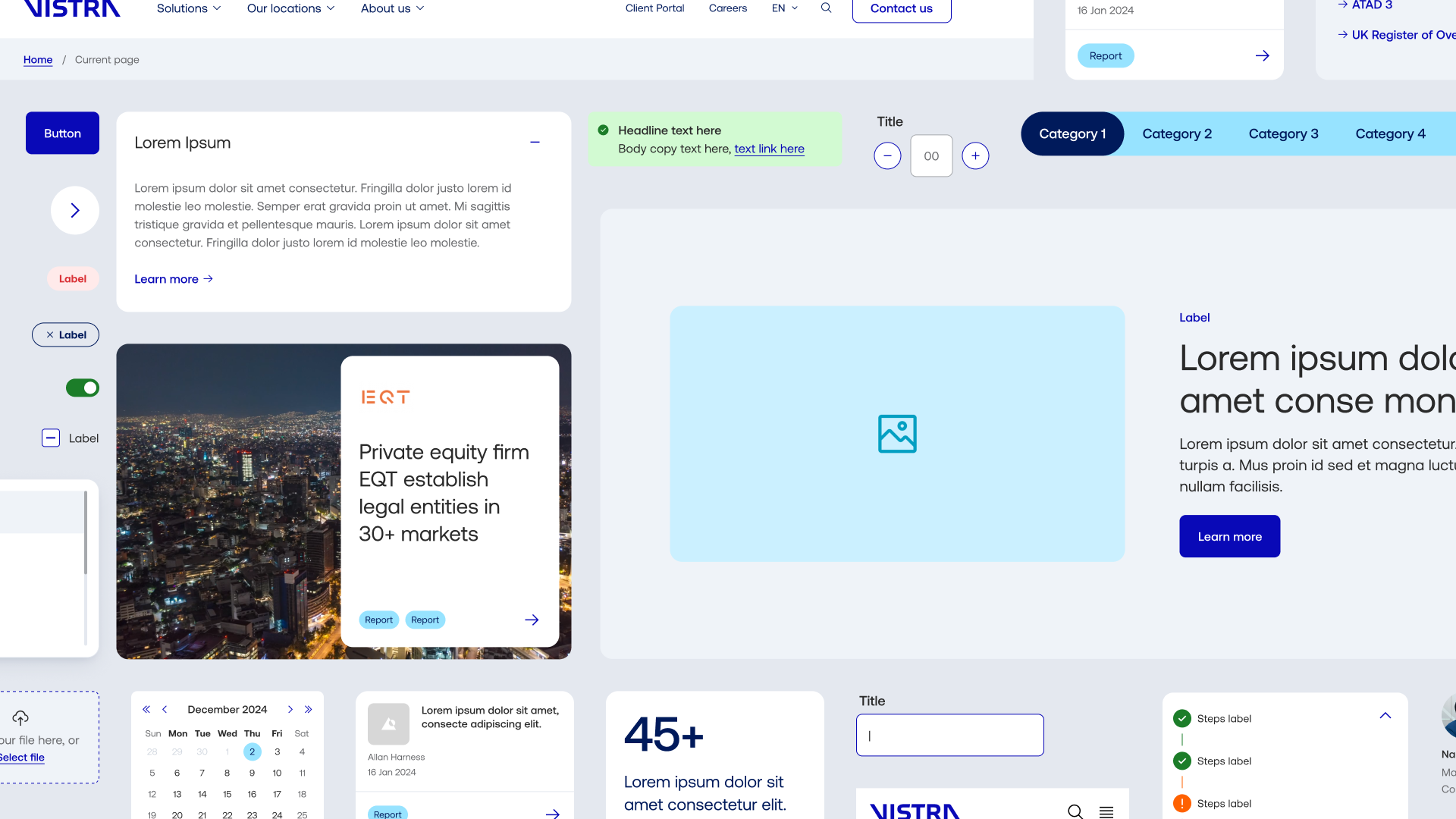
We developed a versatile component set that could be used both in the corporate website and in operational dashboards. Each component was fully documented: anatomy, behavior, associated tokens, variations, and usage guidelines.
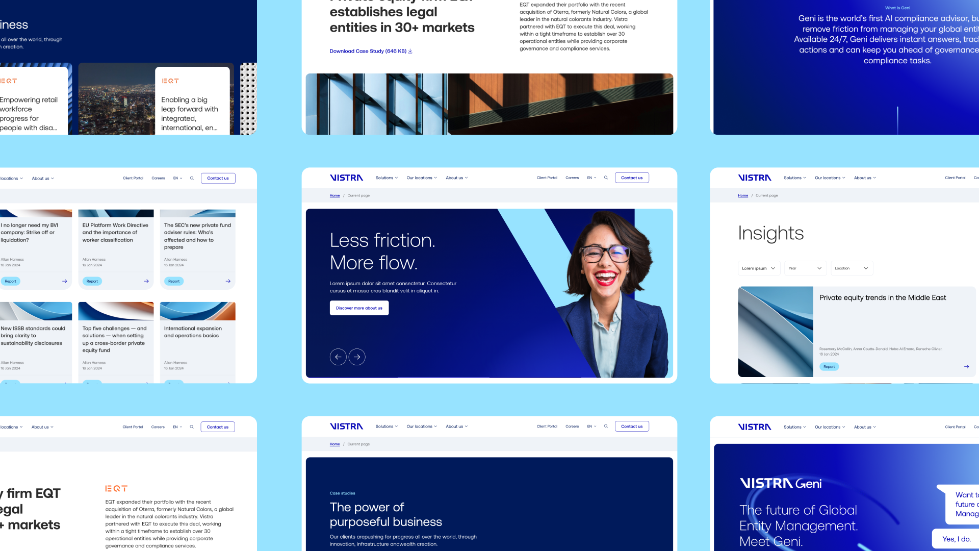
We also designed specific templates tailored to different products—especially focused on digital marketing needs and the institutional website’s content structure.
Motion & Interaction
We incorporated clear motion and interaction guidelines, with practical examples applied to different user flows. Microinteractions and transitions were designed as tools to support comprehension without adding noise to the experience.


Transitions patterns
We define the transition patterns as a crucial element of the motion system, essential for fluid user navigation and managing UI motion.
- Default fade
- Upward, Downward, Forward and Backward
- Zoom through
- Slide
- Container transform
Easings
To guarantee the motion system’s scalability, we developed a library of easings, each with specific semantic meaning tied to particular moments or product contexts. This provides a shared resource for designers and developers, preventing redundant effort.
Documentation
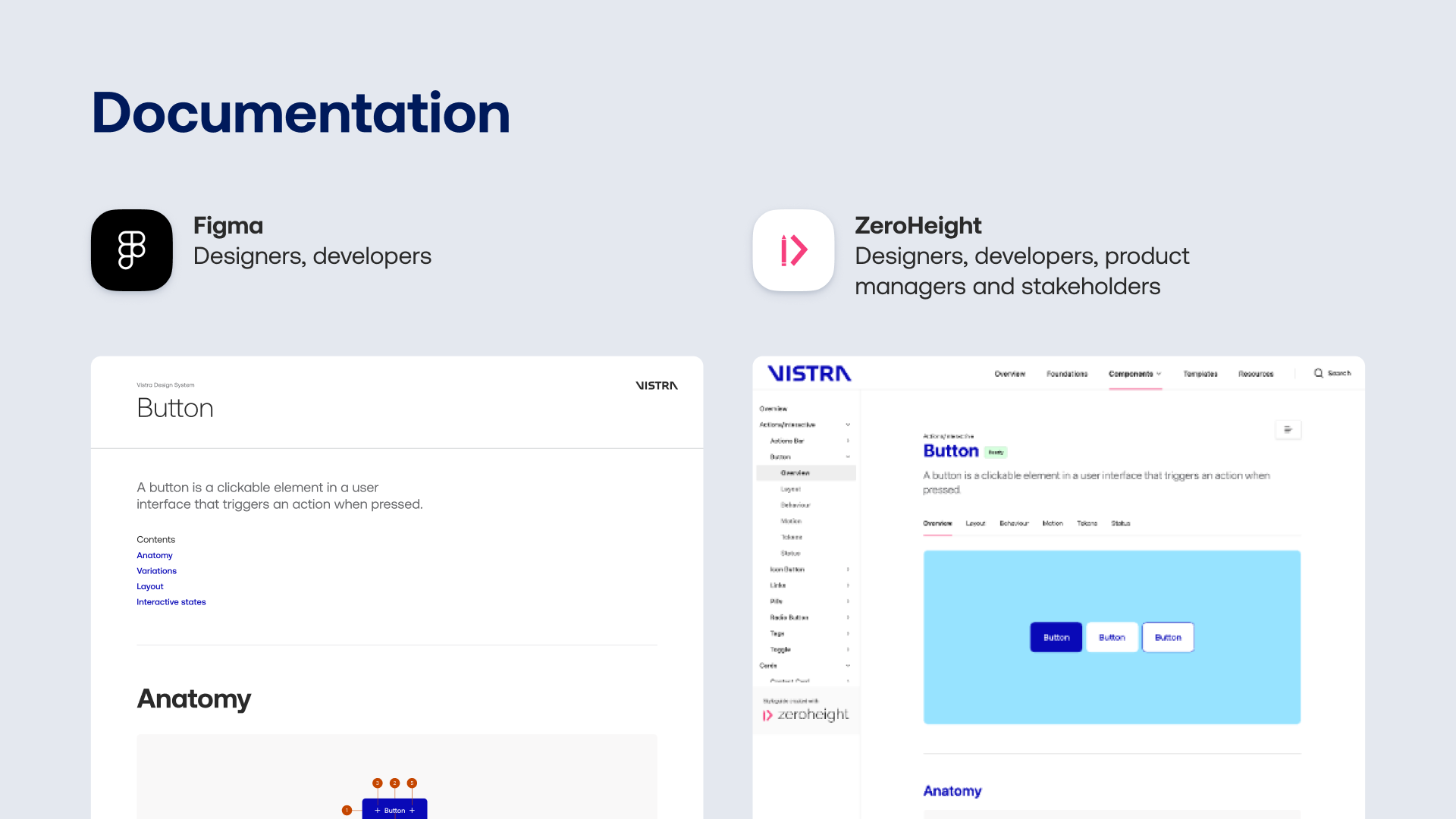
The entire system architecture was documented in Figma and Zeroheight using a unified language aimed at multidisciplinary teams. The goal was to simplify implementation and ensure consistency across all products—regardless of team or region.
Vistra’s design system established a strong foundation for the brand’s digital growth in a context of expansion and integration. Key outcomes include:
Alignment
between the new brand identity and the digital products representing it.
Collaboration
Improved collaboration workflows between marketing, design, product, and development teams.
Living library
A living design library—maintained and updated to meet evolving needs.
