About
Type of client
- Hospitality and food
Price range & timing
TEAMS INVOLVED
Branding, packaging & web design: Ana Ramos. Alvaro Liniers. Matilde Magagnoli.
Social media strategy: Bruno Lisboa. Joao Kraenski.
Research
The project started with a thorough research about Ruvida, the mother brand, and about Italian culinary tradition. We carried out interview sessions with the owners, Michel and Valentina, to perfectly frame the project’s needs. We looked at the origins of Salumerias (Italian delis), Aperitivo and focaccia from an historical point of view to integrate the essential cultural component of the project.
Brand architecture
The first necessity was to create a brand architecture and to define the relationship between Ruvida and the two new restaurants. We created an open system, with Ruvida at the top, to give freedom to implement new future businesses in the family.
Naming
We then proceeded to define the brand names. We performed an internal naming workshop, structured in different rounds, that led to a range of possible names that were then proposed to the client.
The selected names were the following:
Pausa, la salumeria di Ruvida
Crescente, la focacceria di Ruvida
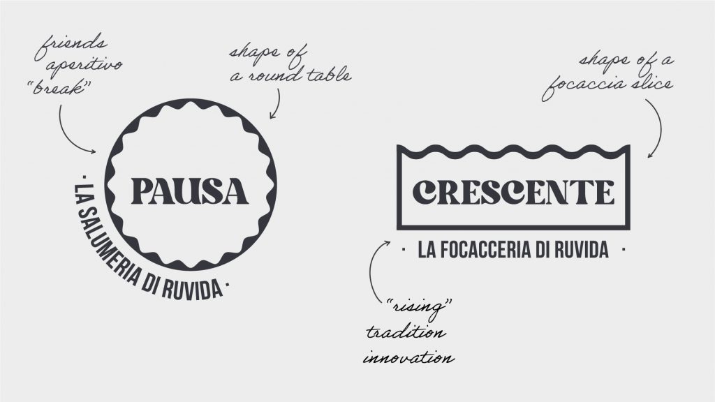
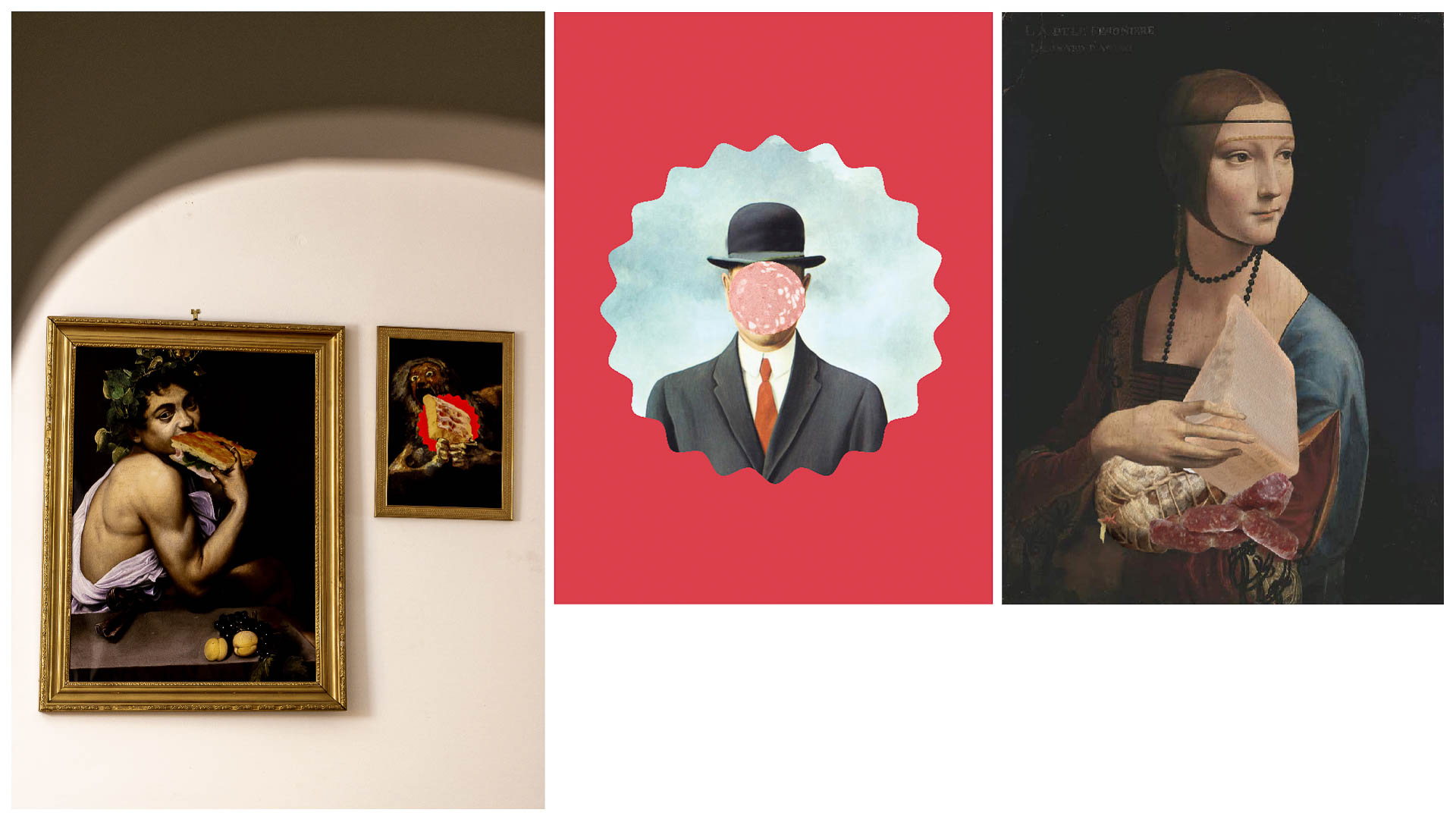
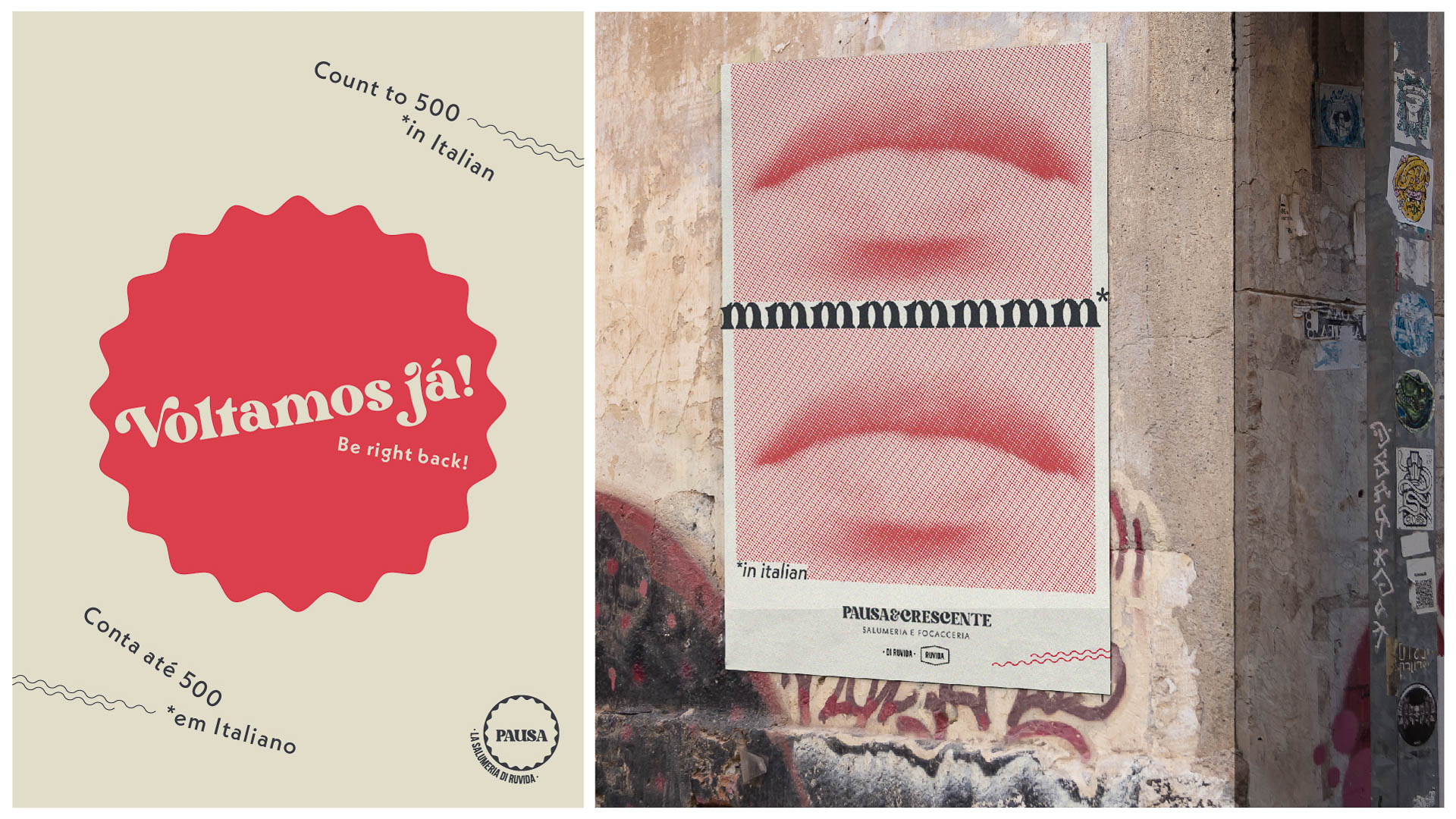
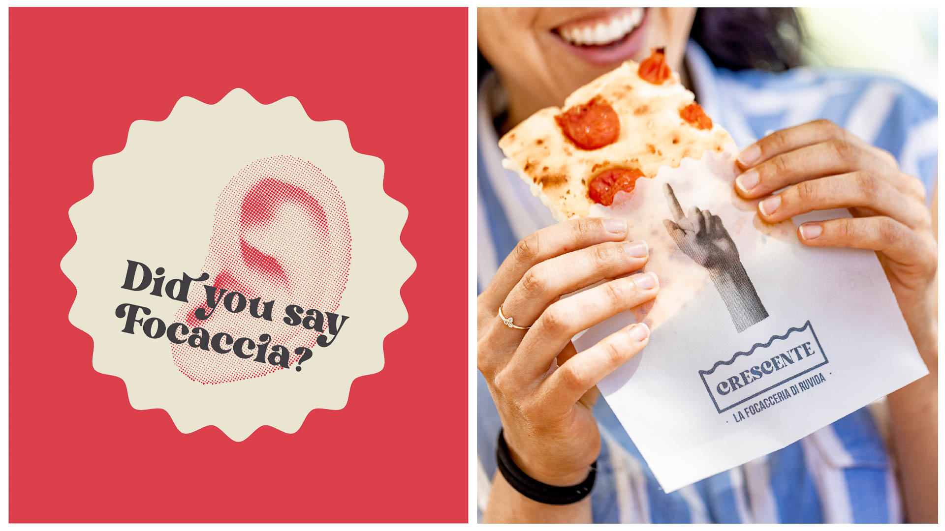
F26 designed a modern brand identity, mixing tradition andzq authenticity with a young and witty visual language.


Tone of voice
After defining the main brand elements, we developed the brands’ tone of voice to give a personality to the businesses: we performed a workshop to define the main traits and how the brands were going to communicate to the public. We introduced and integrated some key messages in the visual identity.
Design
With a clear idea of the business desired positioning and tone of voice, we developed an integrated visual identity system for Pausa & Crescente, maintaining a visual coherence with the mother brand Ruvida. We started exploring compositions and applications on an array of printed and online supports.
Touchpoints
In order to expand the visual identity with brand applications, we developed a communication strategy by defining the brands’ touchpoints.
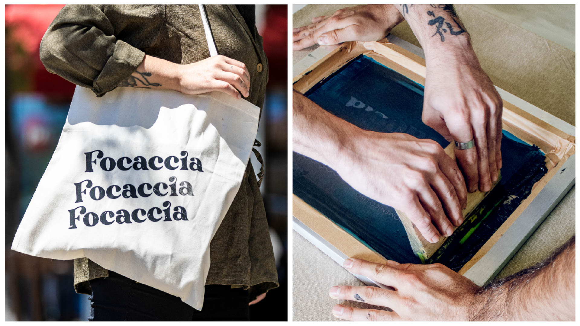
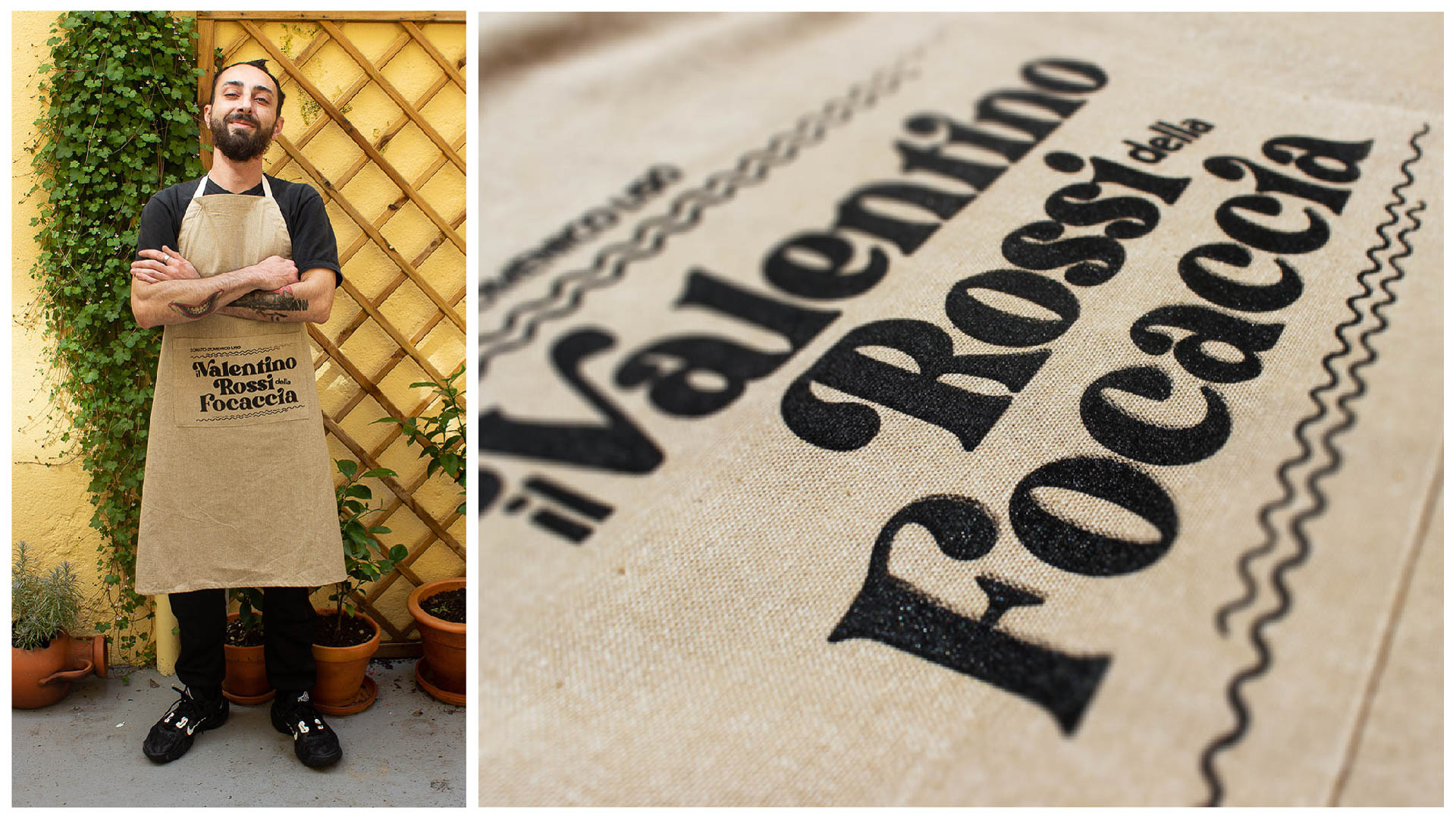
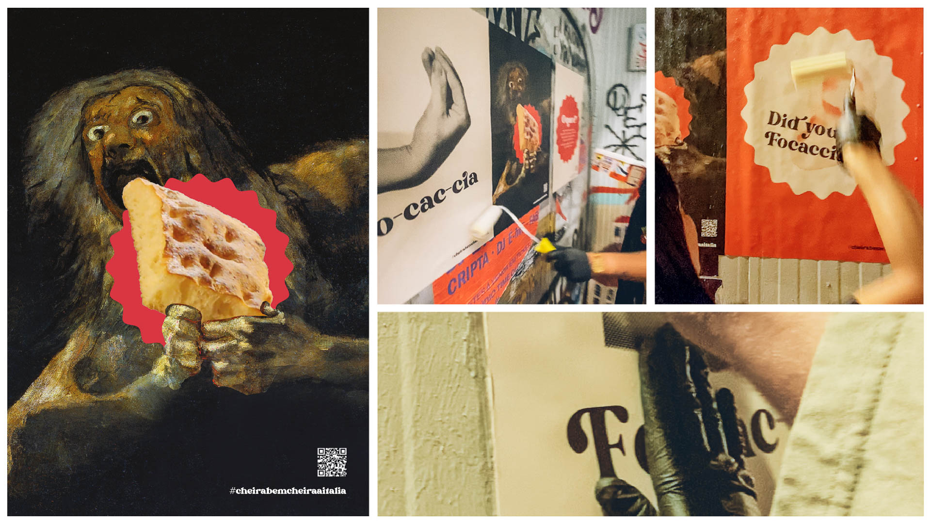
We explored more traditional touch points such as social media channels, business cards and stickers, and less conventional ones, such as guerrilla posters, product booklets and aprons.
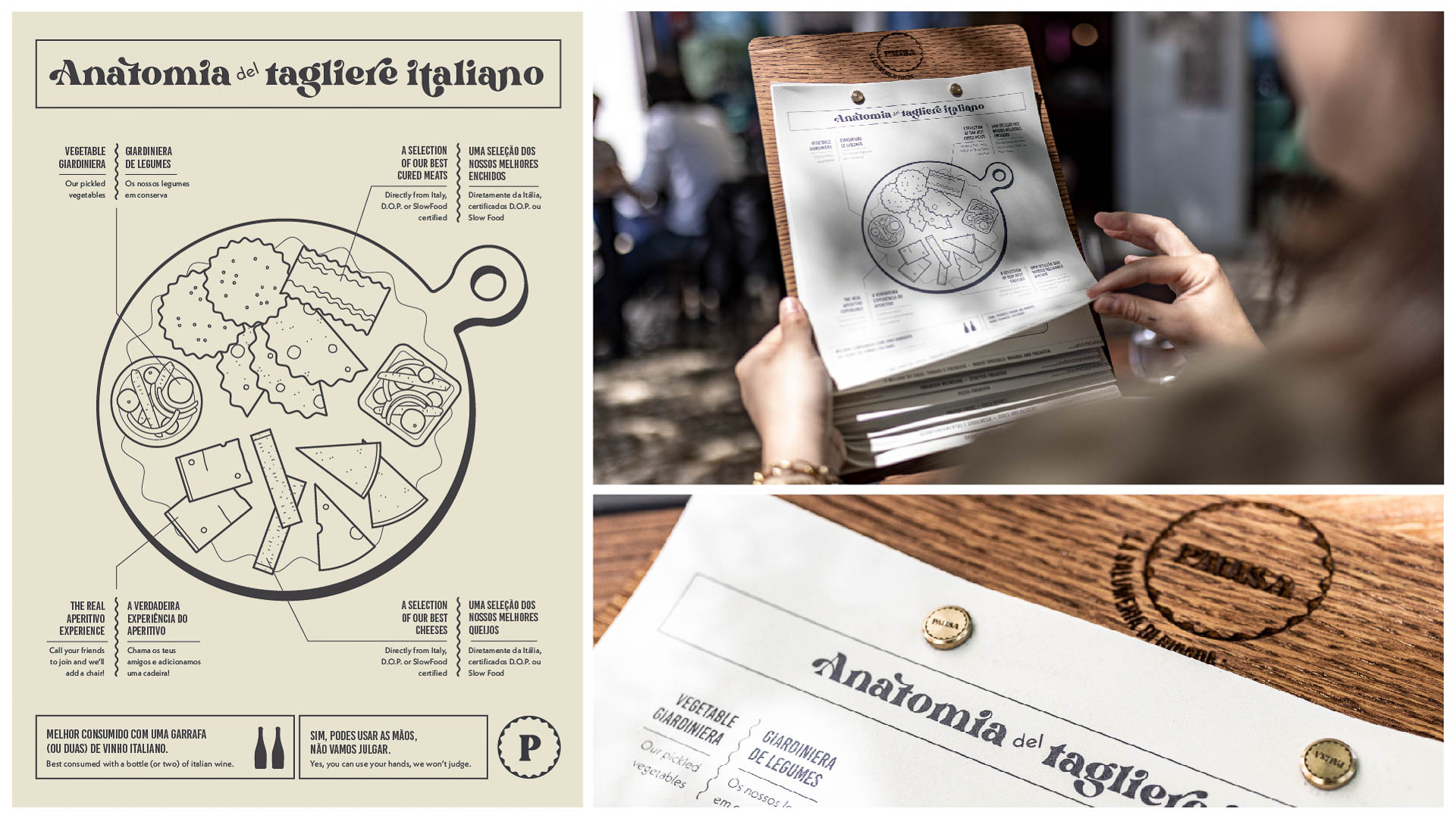
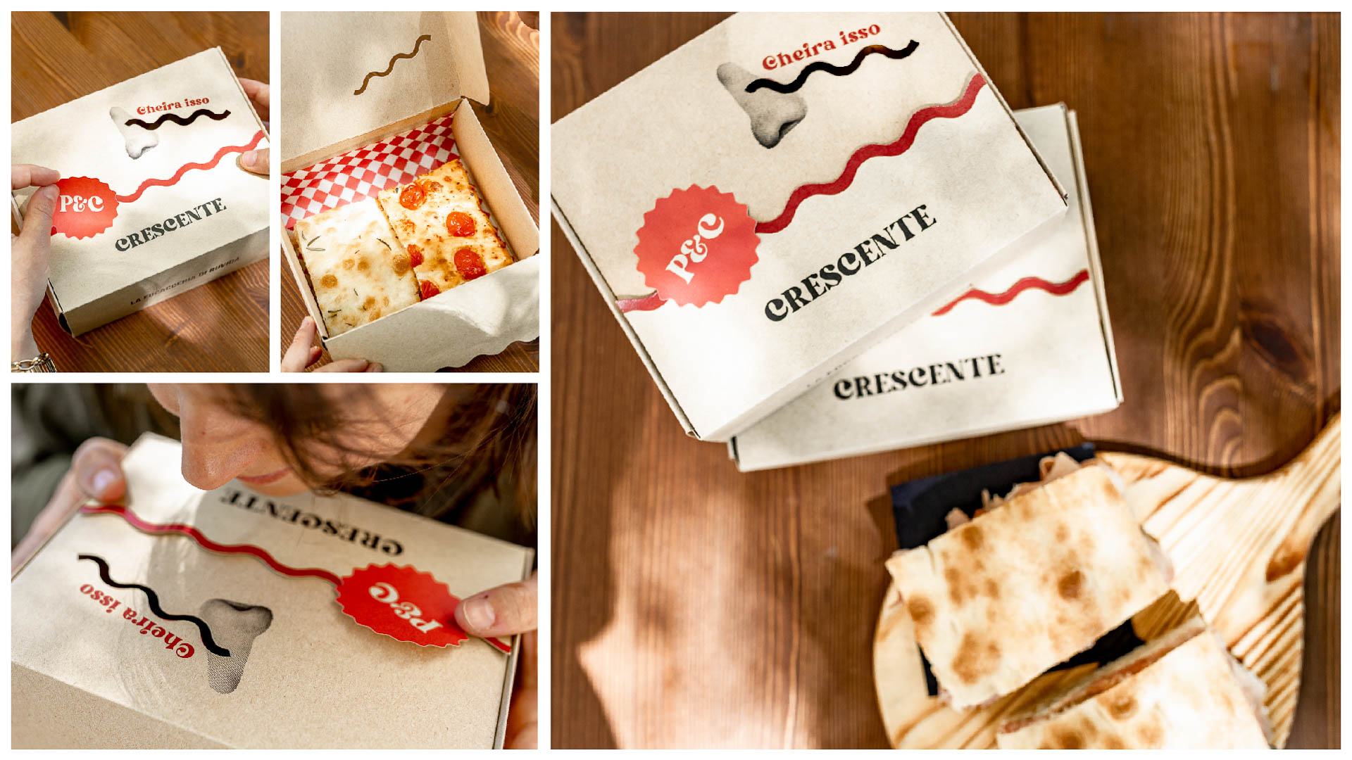
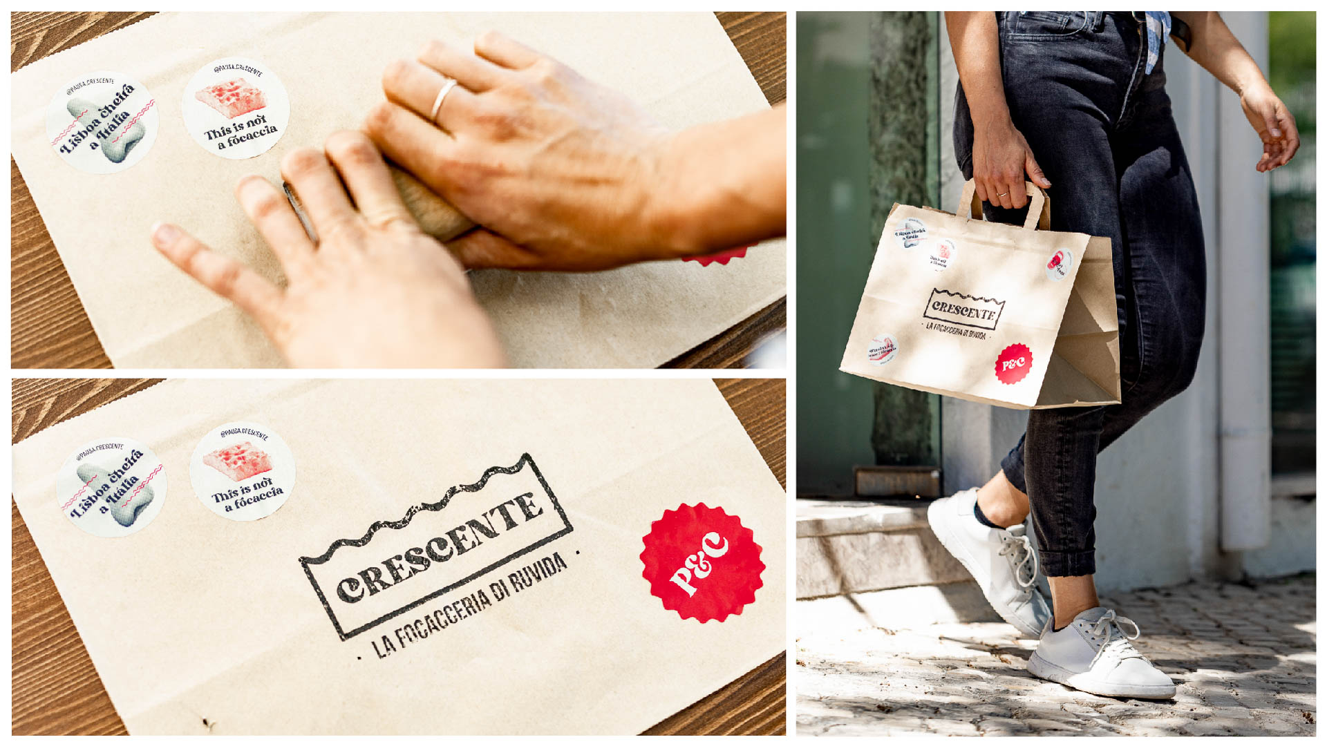
A journey to Italy through the five senses
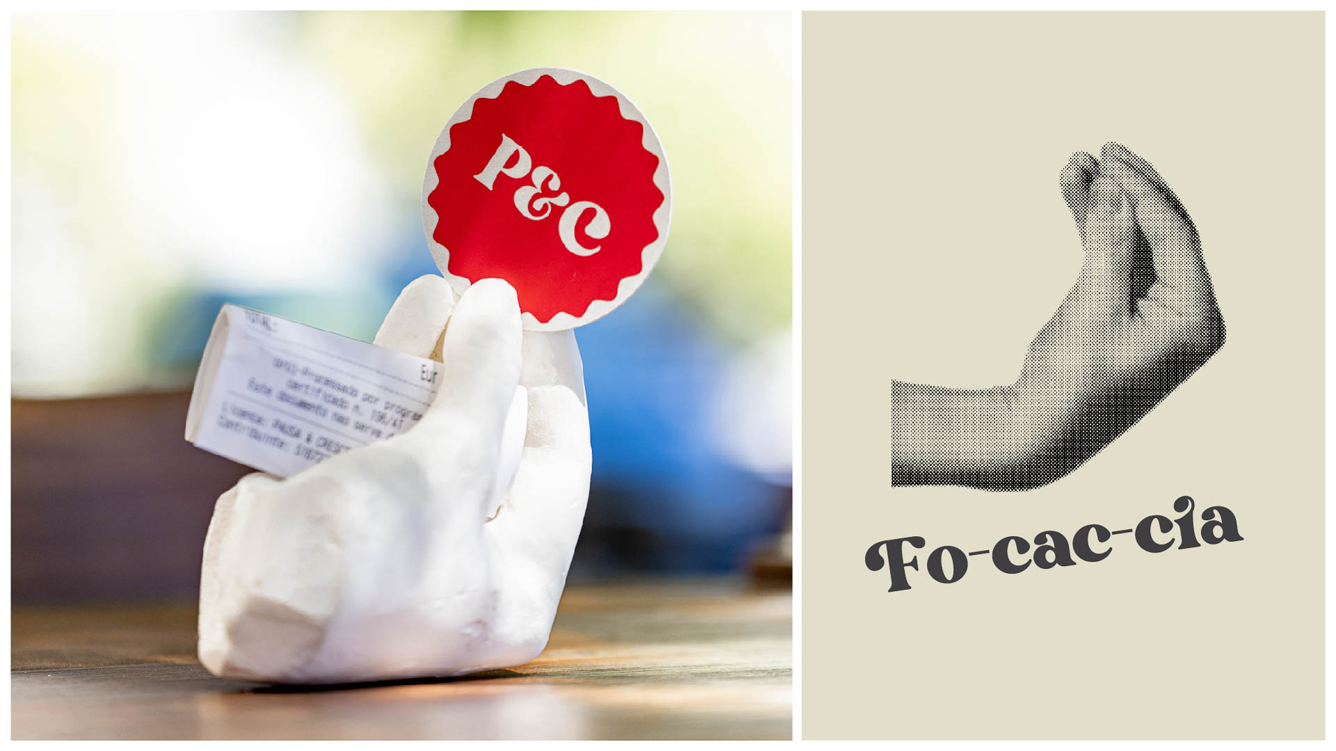
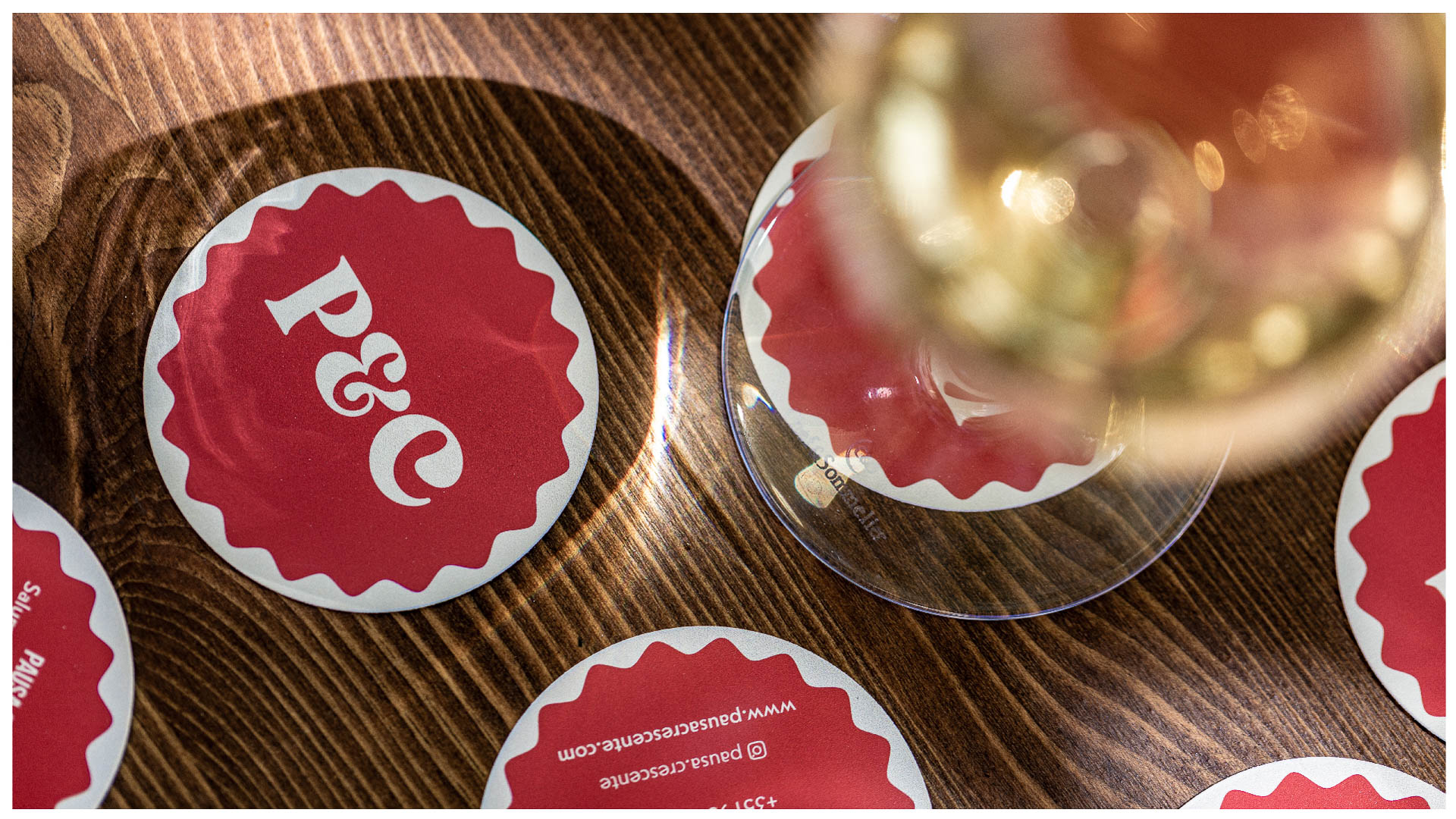
A journey to Italy through the five senses
